My Year in Films & TV, Wrapped
I liked the idea of Spotify’s Year Wrapped—a summary of the year in terms of media consumption— but the cancelled shows, lack of travel, and dip in regular driving drastically decreased my music intake in 2020. I did however, watch a metric shit-ton of movies and television while isolating and social distancing. Interested in a different kind of year-end roundup, I collected all of my streaming data and purchase/rental history for the past 12 months into a huge spreadsheet, and created my own version— My Year in Film and TV, Wrapped. (TL;DR— This is what happens when a UX Designer cinephile finally has a few days off work to work on a personal project!) See below for a look at how I did this.

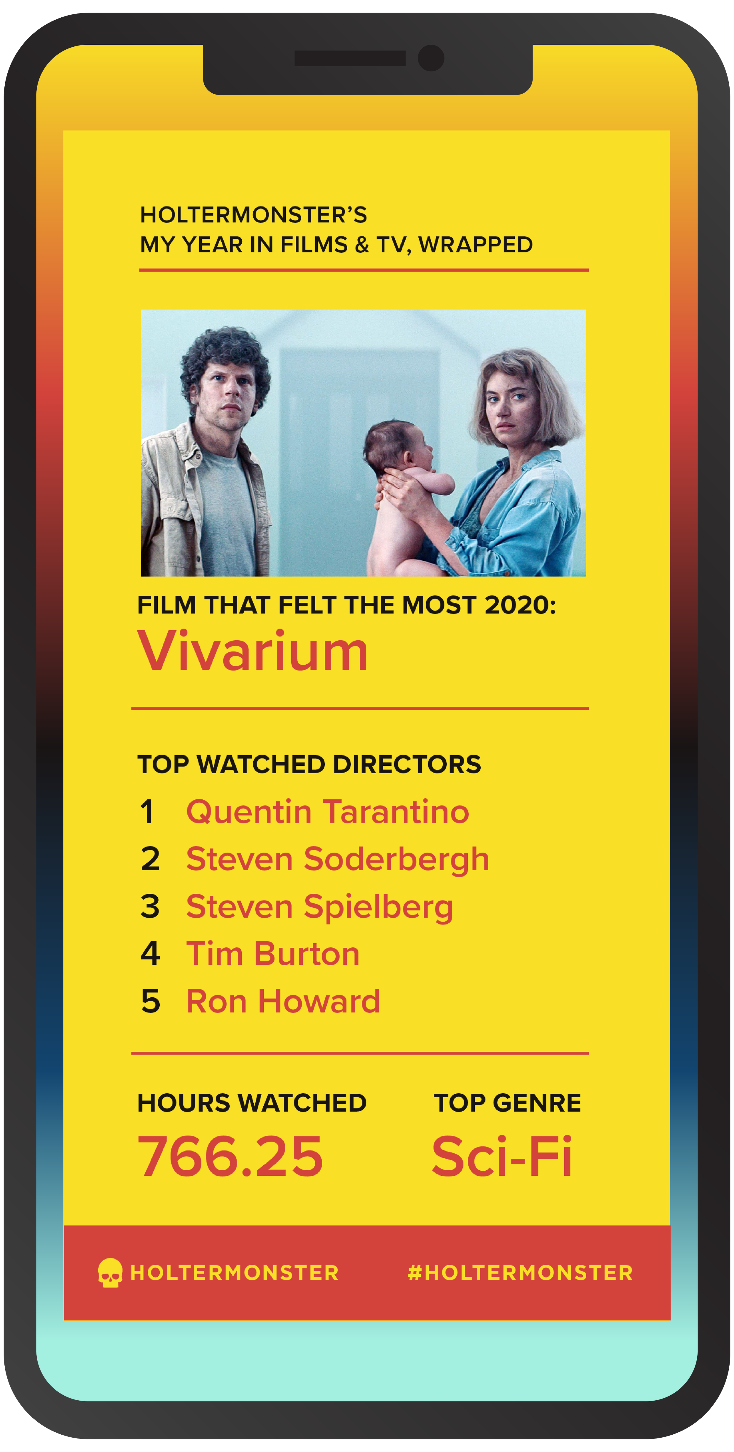
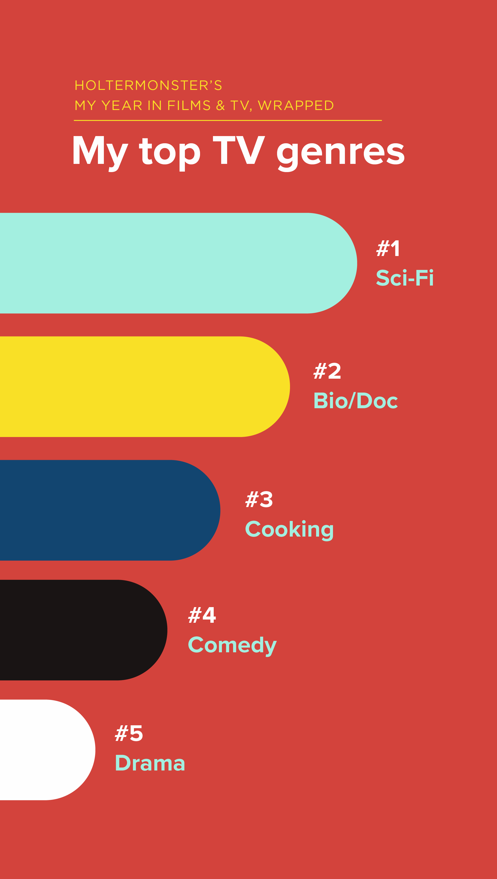
The Individual Story Panes


The Inspiration
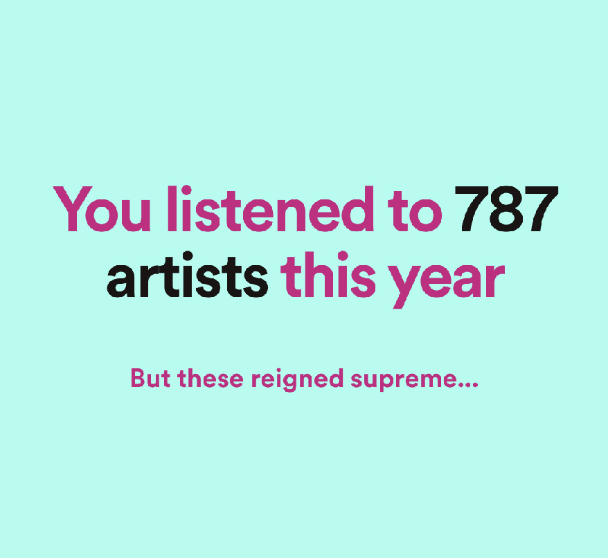
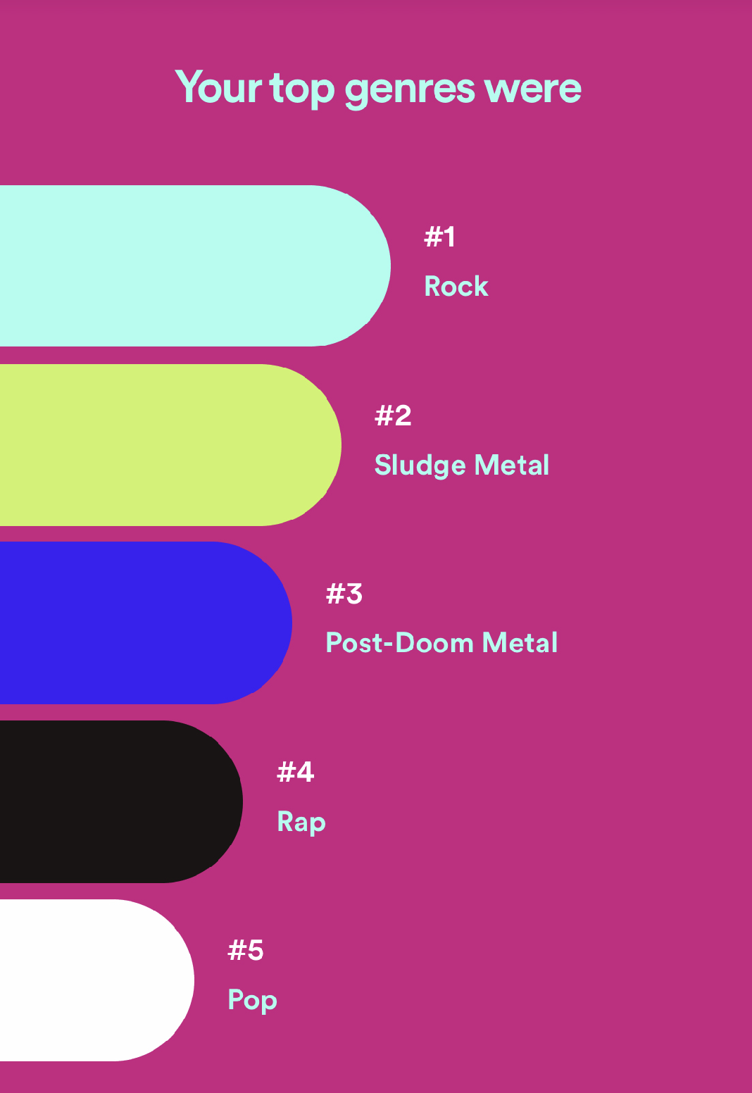
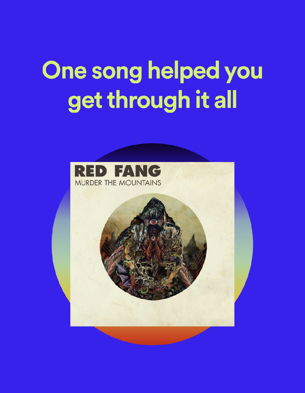
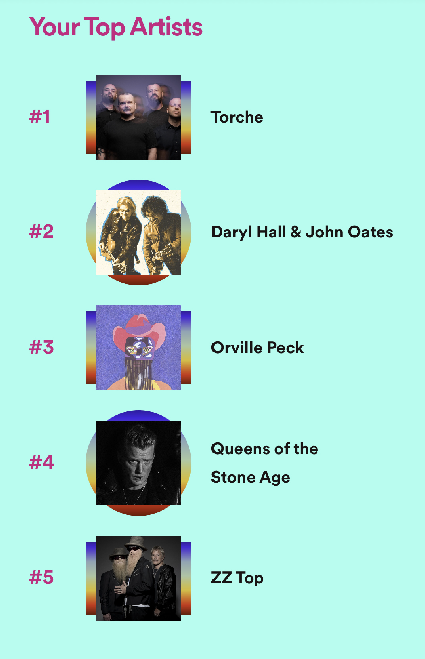
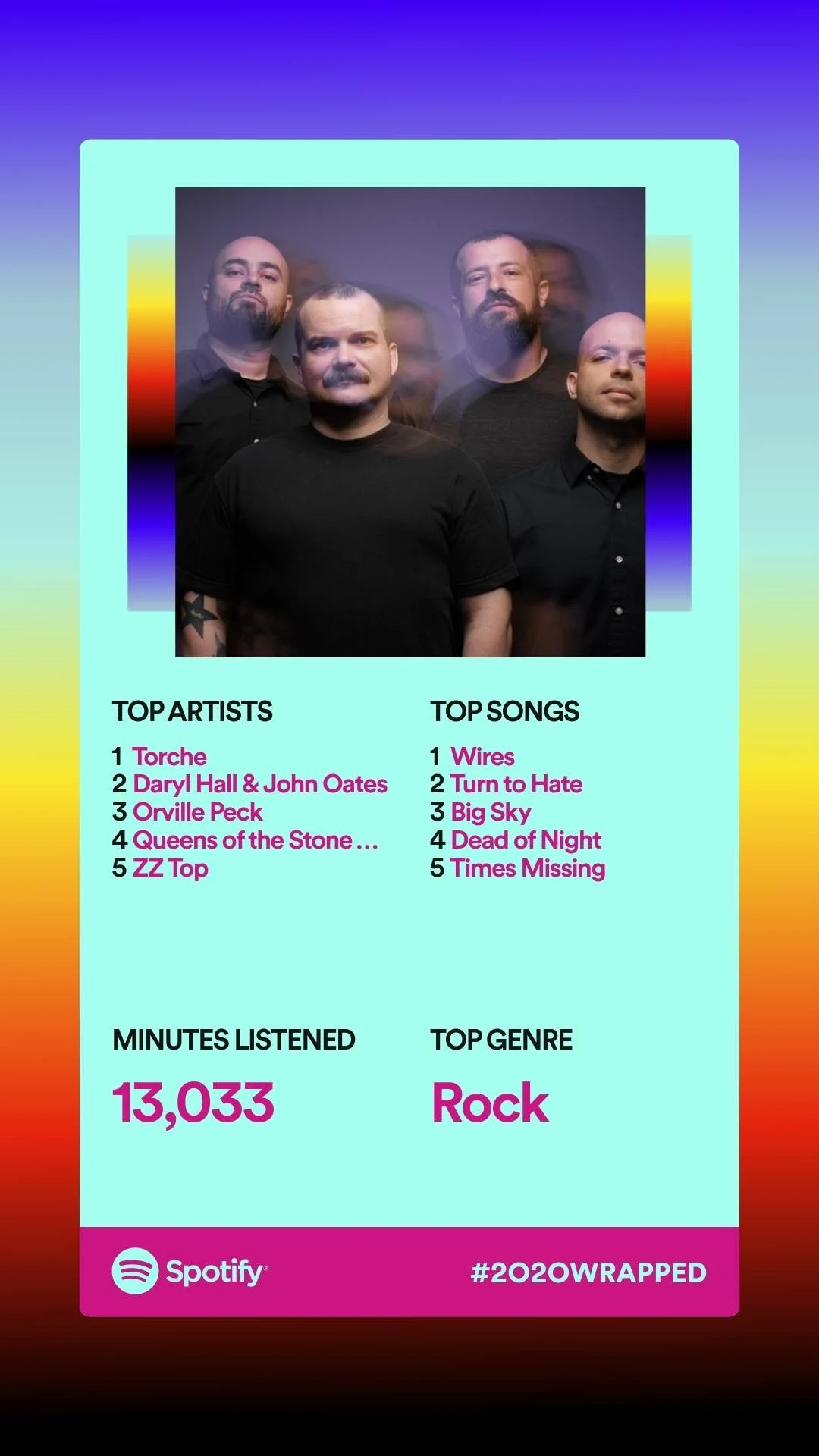
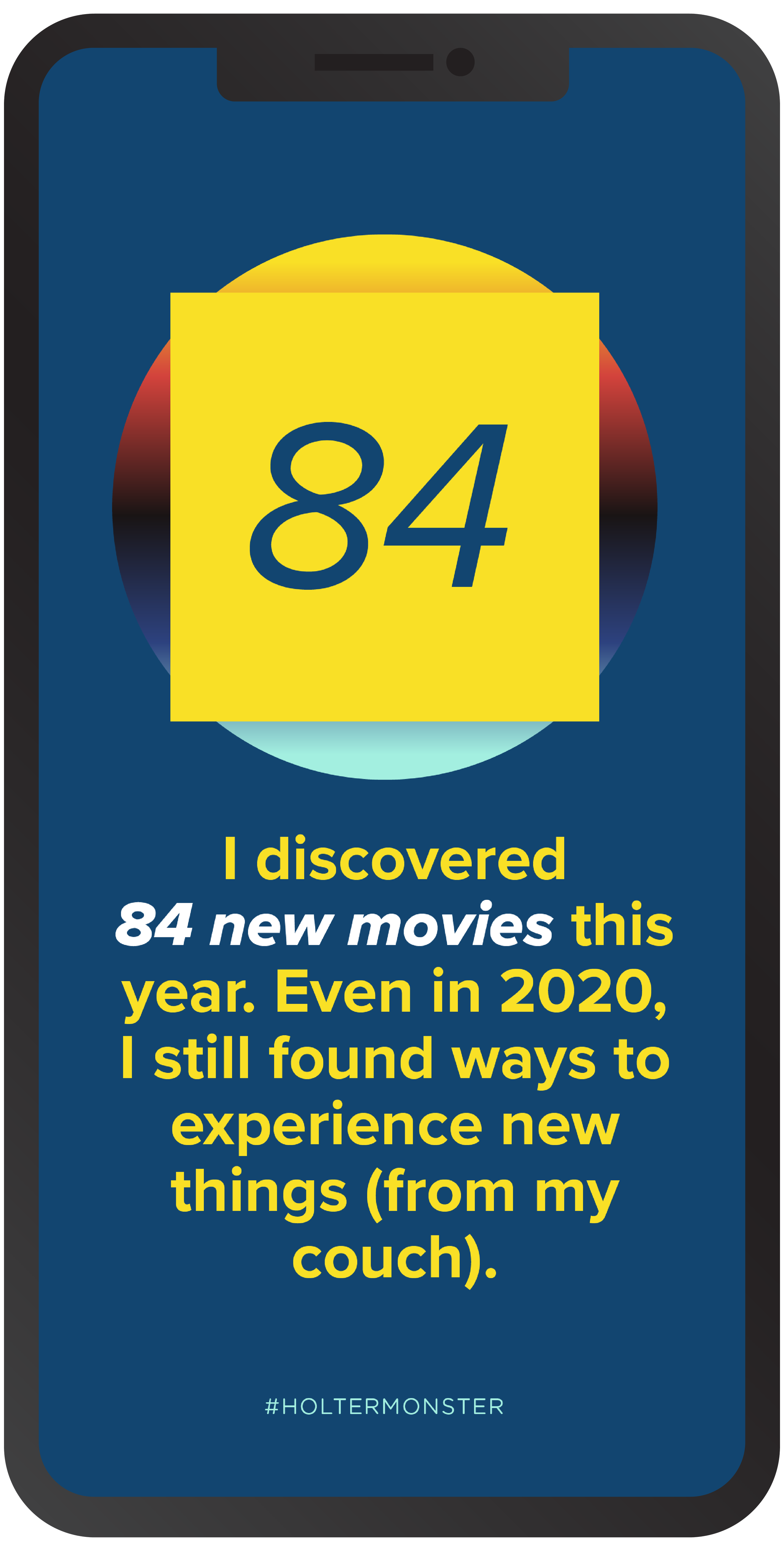
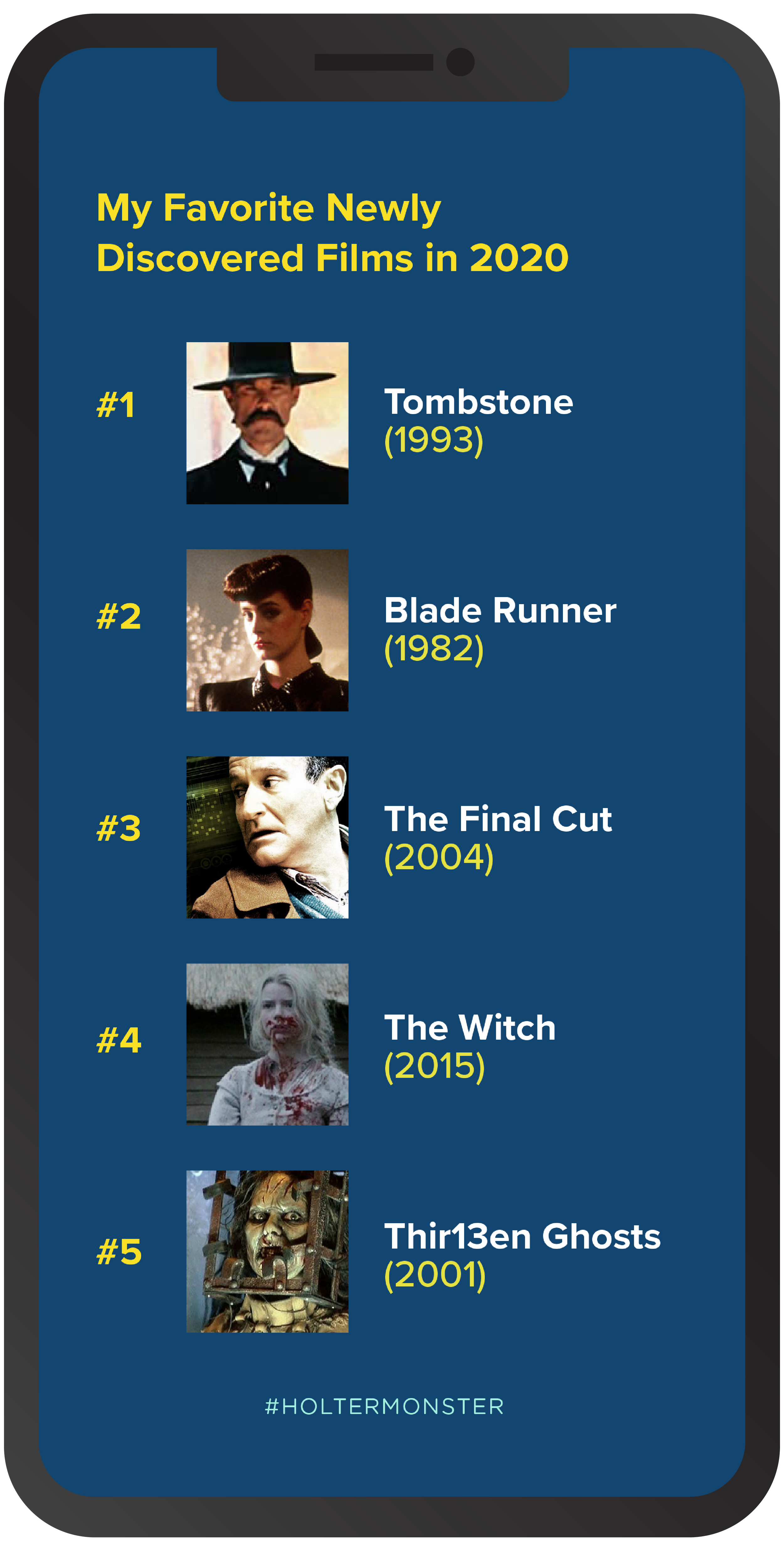
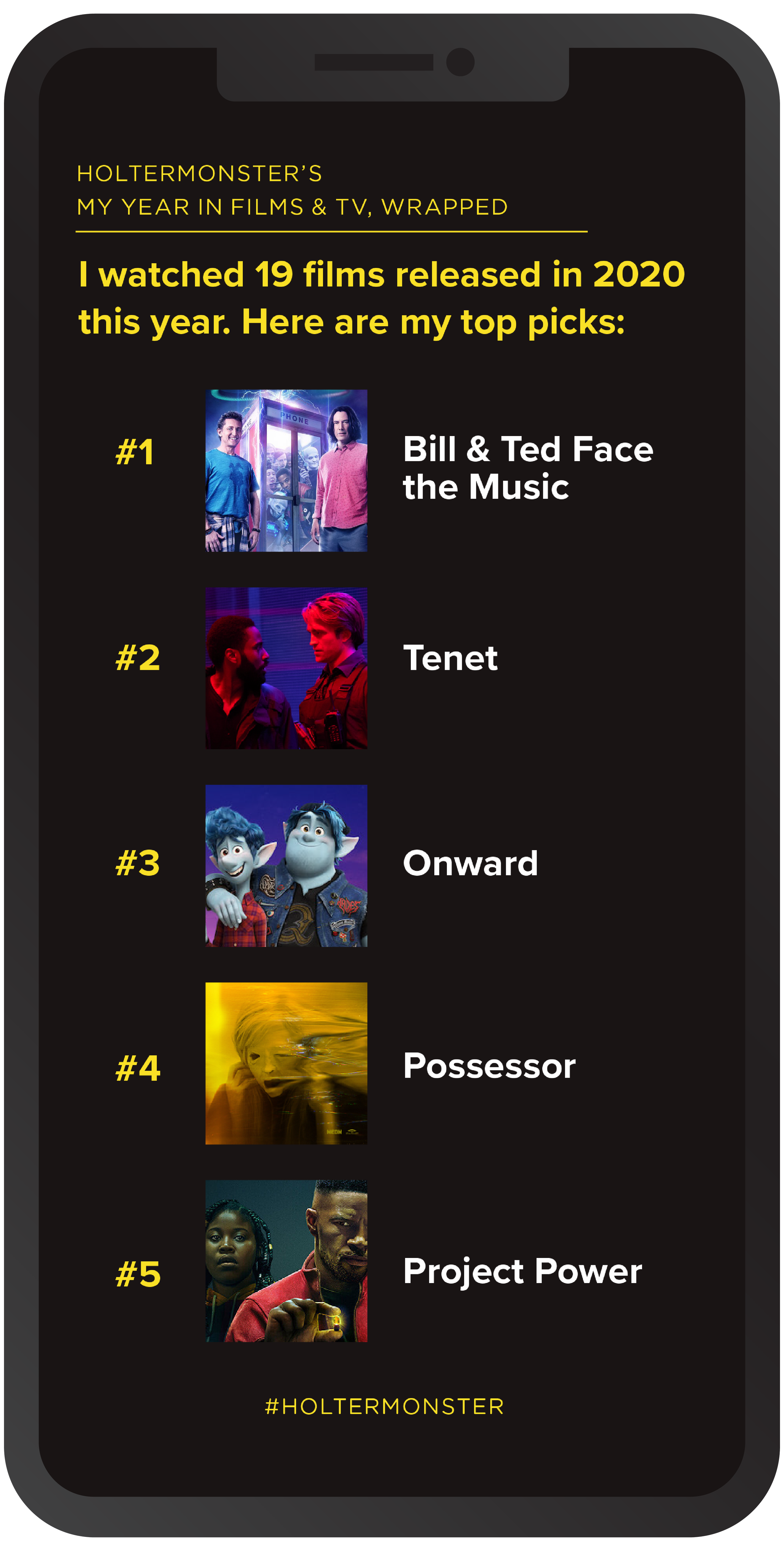
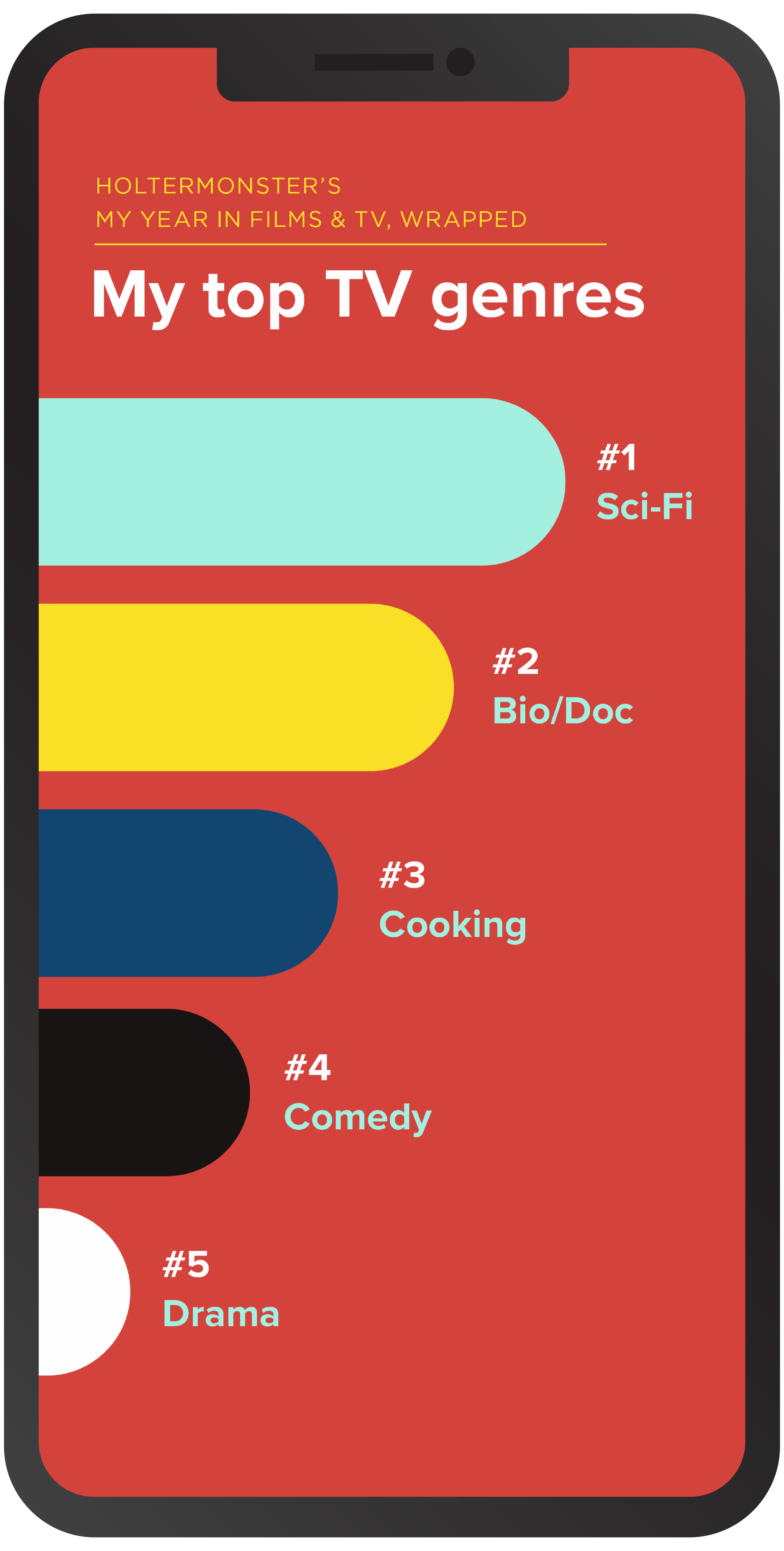
I started this endeavor where I start most any project— with research. I collected screenshots of “My Year Wrapped” from Spotify to scope for design elements I could mimic, like the Top 5 horizontal barchart, or the big font declaration on an empty background.
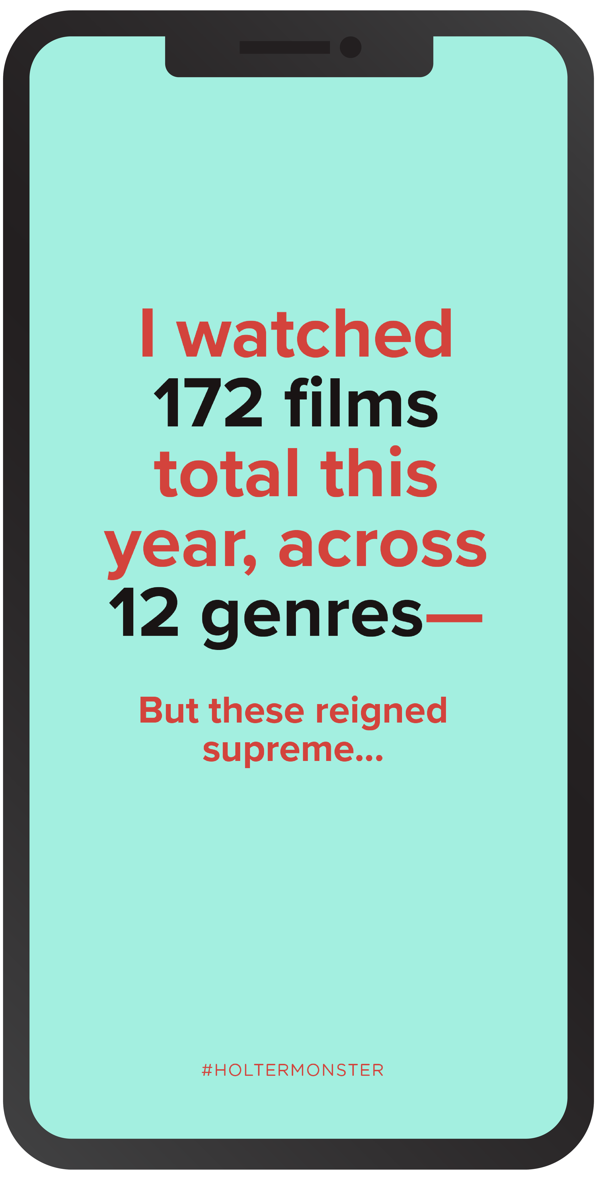
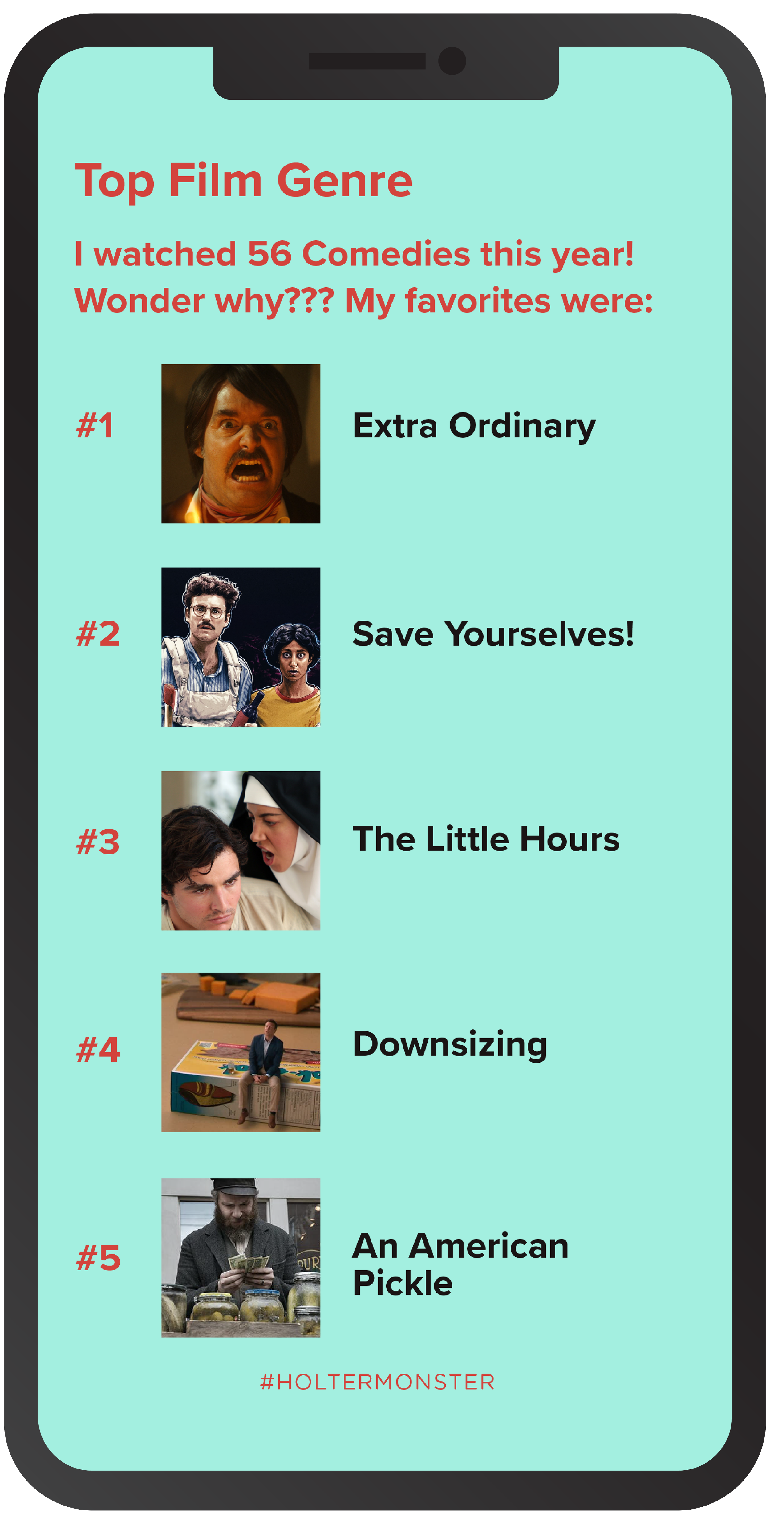
I also made notes on the kind of data these graphics showed, and how it was displayed, which helped me figure out what kind of data I’d need about the media in my list. For example, “You listened to 787 artists this year” would lend its form to a more relevant factoid, “I watched 175 movies this year.”

Collecting Streaming Data
Then I started collecting my own viewing data as best as I could from all of the sources:
Netflix— Netflix will let you download a tidy little CSV file of your entire viewing history here: Netflix Viewing Activity.
Apple TV— I combed through my Apple TV Purchase History on iTunes, with the Time Range set to 2020.
Amazon Prime— I gathered some data from the My Digital Orders page, set to 2020. I combined that with titles manually collected from the “My Stuff” section, which will indicate if a program has been watched, and how much (helpful for counting watched episodes of a series).
Hulu— For this exercise, Hulu was pretty hard to gather data from. There is no tidy CSV download, or viewing history— just a “Continue Watching” section, which will only house media you stopped before the end. But like most every other streaming platform, Hulu has a visual indicator of movies/episodes that have been watched, so I was able to manually collect a lot of data just from combing through my Watchlist and checking for the indicator.
HBO Max— Definitely the most difficult to pull data from, with the same issue as above. I know we’d used HBO to watch a few specific movies over the year, and the film selection is pretty small relatively, so I manually combed the genre pages looking for titles with the “watched” indicator, and took note of them.
In-Theatre— I’m a nerd and I catalog a lot of my life anyway, so I happened to have the data on the few films we saw in theatres this year before quarantine.
Fleshing Out the Data
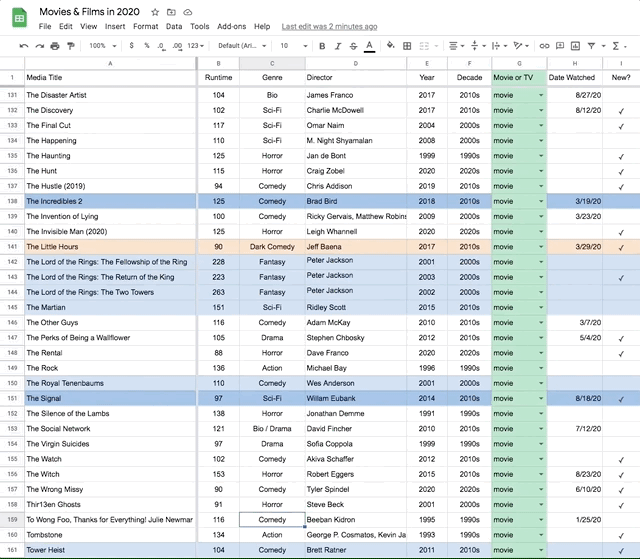
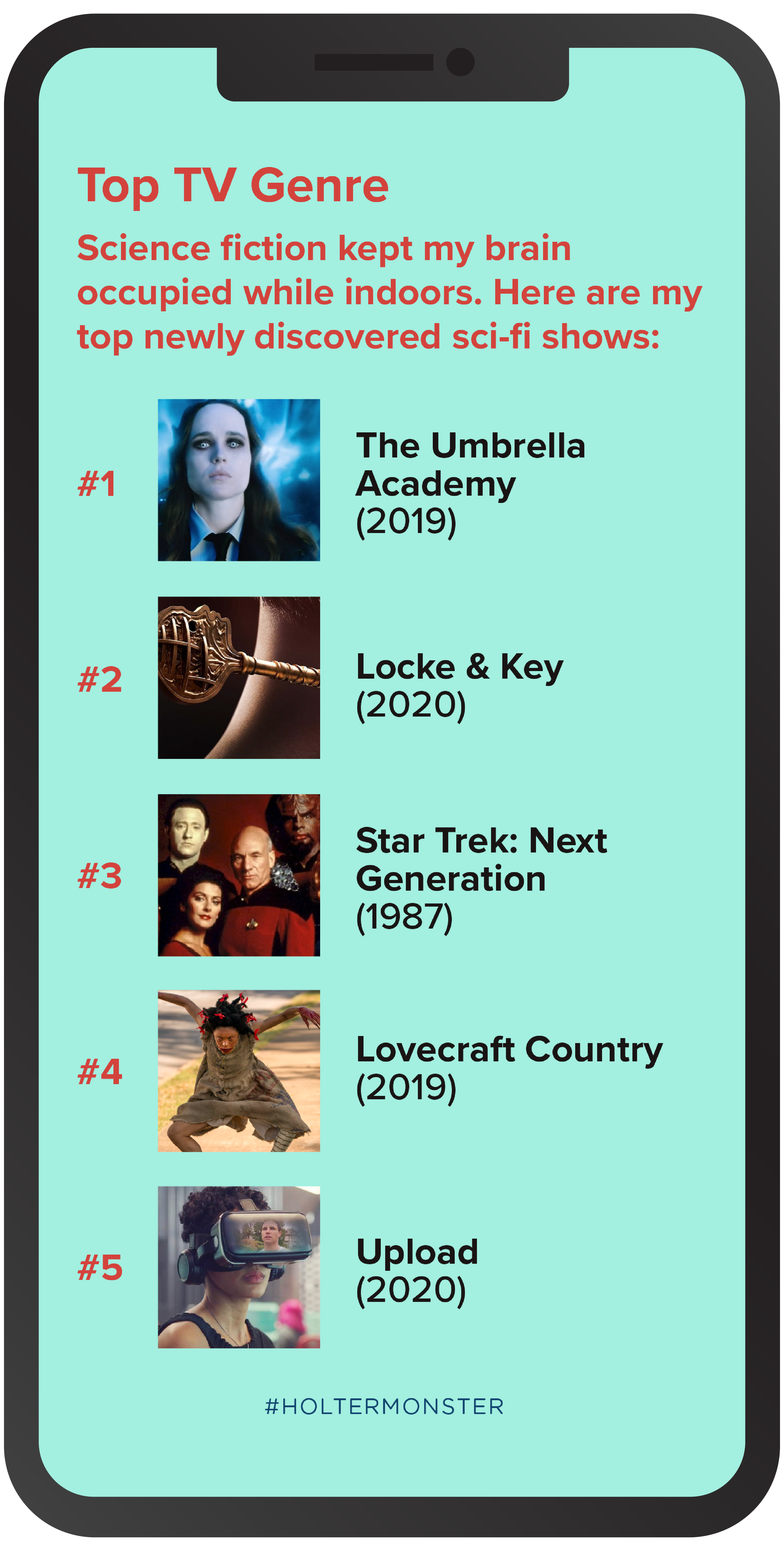
I defined some key data insights based on the kind of data I wanted to display, which in turn gave me a list of data points I would need to collect about each media title: Movie vs. Show, New (to me), Genre, Year/Decade, Director, and Runtime.
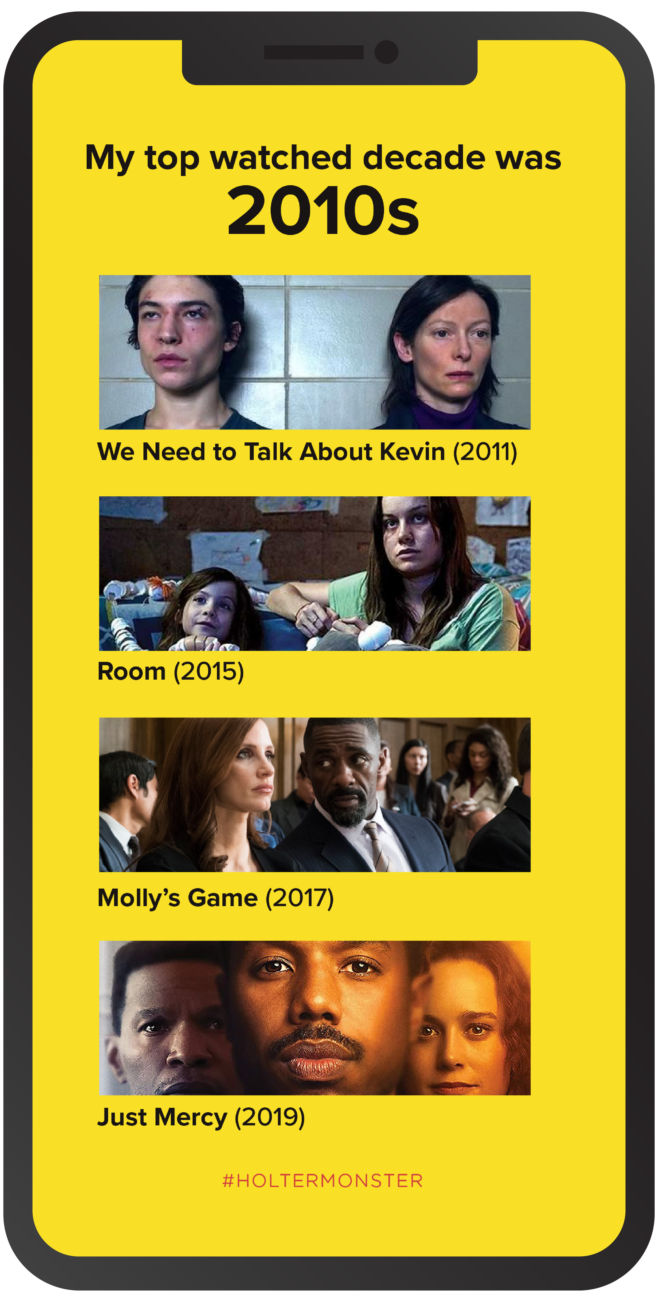
I organized everything into a big-ass Google Sheets spreadsheet, and used the Data > Sort Range function to sort this same table lots of different ways: for example, by director to look for films by multiple directors, or by release year to determine my most watched decade.
Making it a Holtermonster Original
I updated the color palette to be a little more Holtermonster, and used Spotify’s familiar typeface Proxima Nova. The final product is just what I was looking for! A reasonably convincing year-end summary from some fictitious app that aggregates all of your personal viewing data for the year into a slick set of story-ready graphics a’la Spotify. Compare Spotify’s overall summary graphic with my Holtermonster Year in Films & TV, Wrapped graphic below.