
Time Warp Drive-In is a series of dusk-til-dawn movie-marathon nights at the Malco Summer Drive-In, one of America’s last remaining original drive-in theatres which sadly closed in May 2025. Each of the nights were programmed by Memphis’ cult underground video store, Black Lodge, with themes ranging from niche genres to director showcases. One night per month, Screen 4 was lit up with three or four back-to-back movies, many shown at the drive-in for the first time, and some returning to the scene of their original release. Time Warp Drive-In attracted movie-lovers, nostalgia-junkies, and Memphians of all kinds—and in its twelve years, helped reinvigorate sales at the Malco Summer Drive-In, open since 1966.
I’ve been doing these posters since the first event in October 2013, making this one crazy long ongoing project.
Scroll down to check out the entire history!
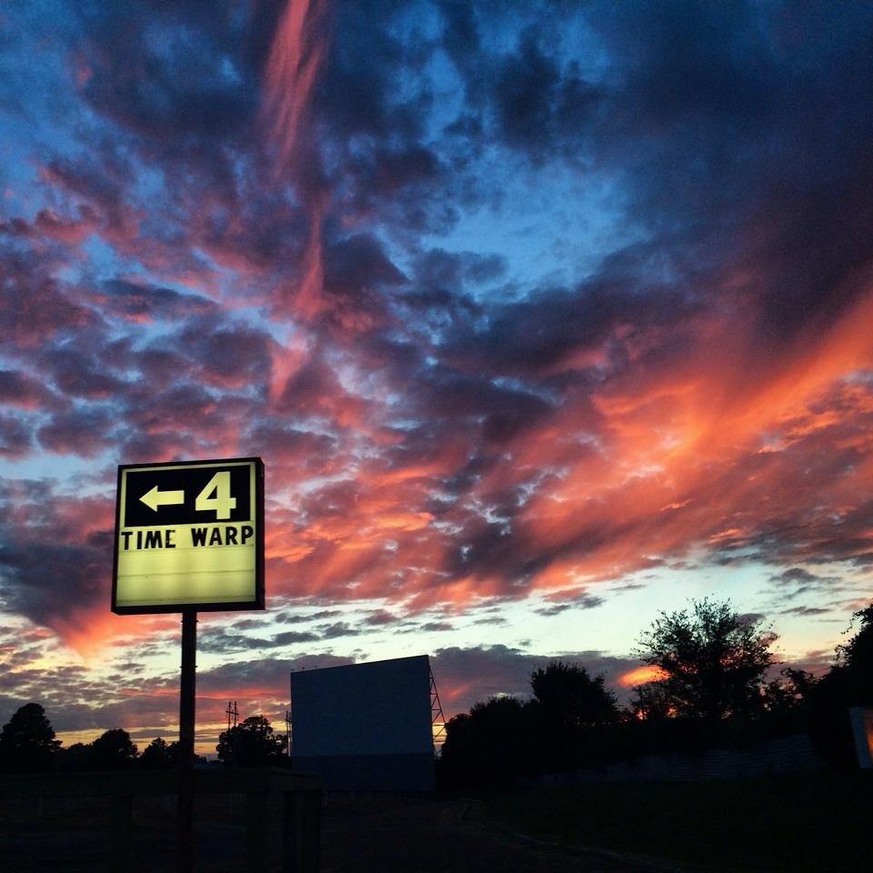
Best sunsets in the world are over the drive-in in Memphis and it’s a proven fact!

Catch me set up at Time Warp Drive-In nights throughout the season selling posters, stickers, and buttons.
Time Warp Drive-In: Season 12 (2025)
(The End)


Time Warp Drive-In: Season 11 (2024)


Time Warp Drive-In: Season 10 (2023)
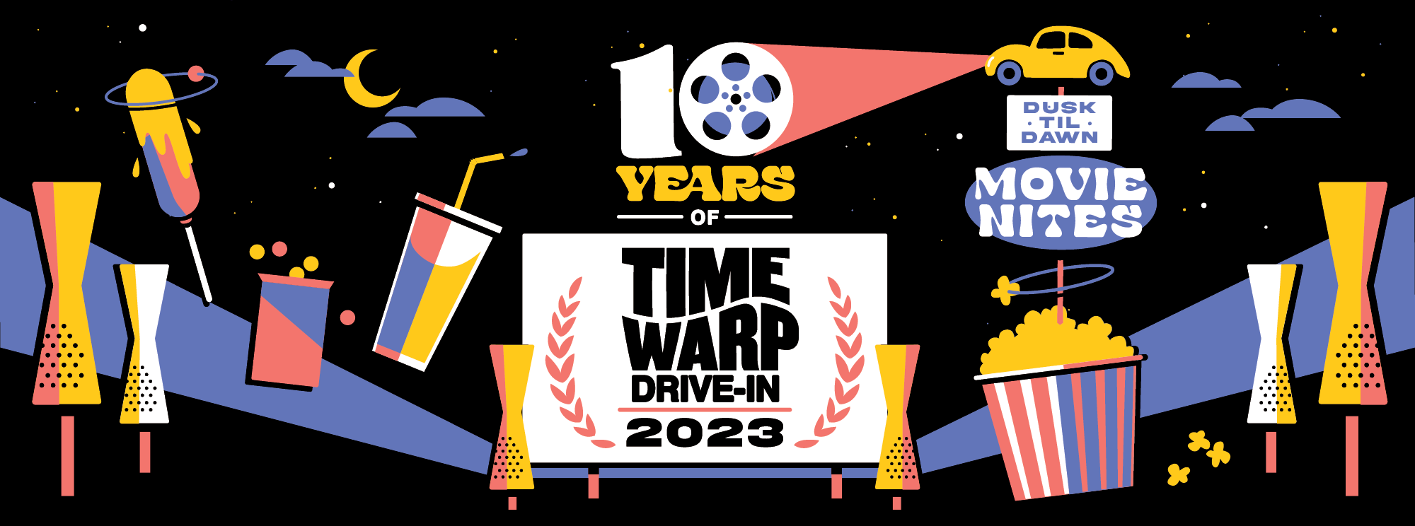
The branding for Time Warp Drive-In 2023 is all about celebrating our 10th season, and the simple pleasures of the drive-in— the night sky, the screen, the vintage signage of the Malco Drive-In, and of course— the incredible old school concession stand.
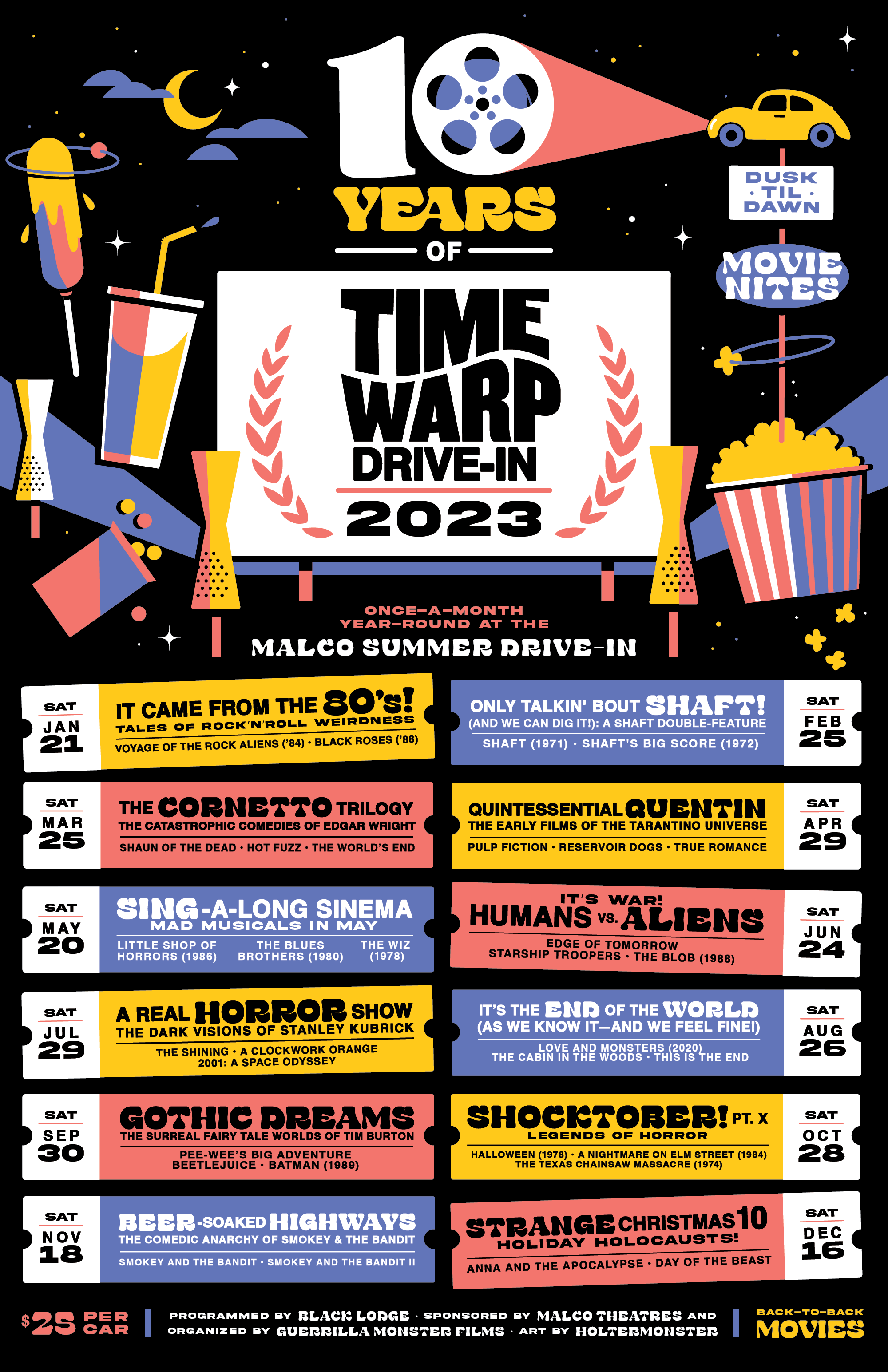


10 Years of Time Warp logo system
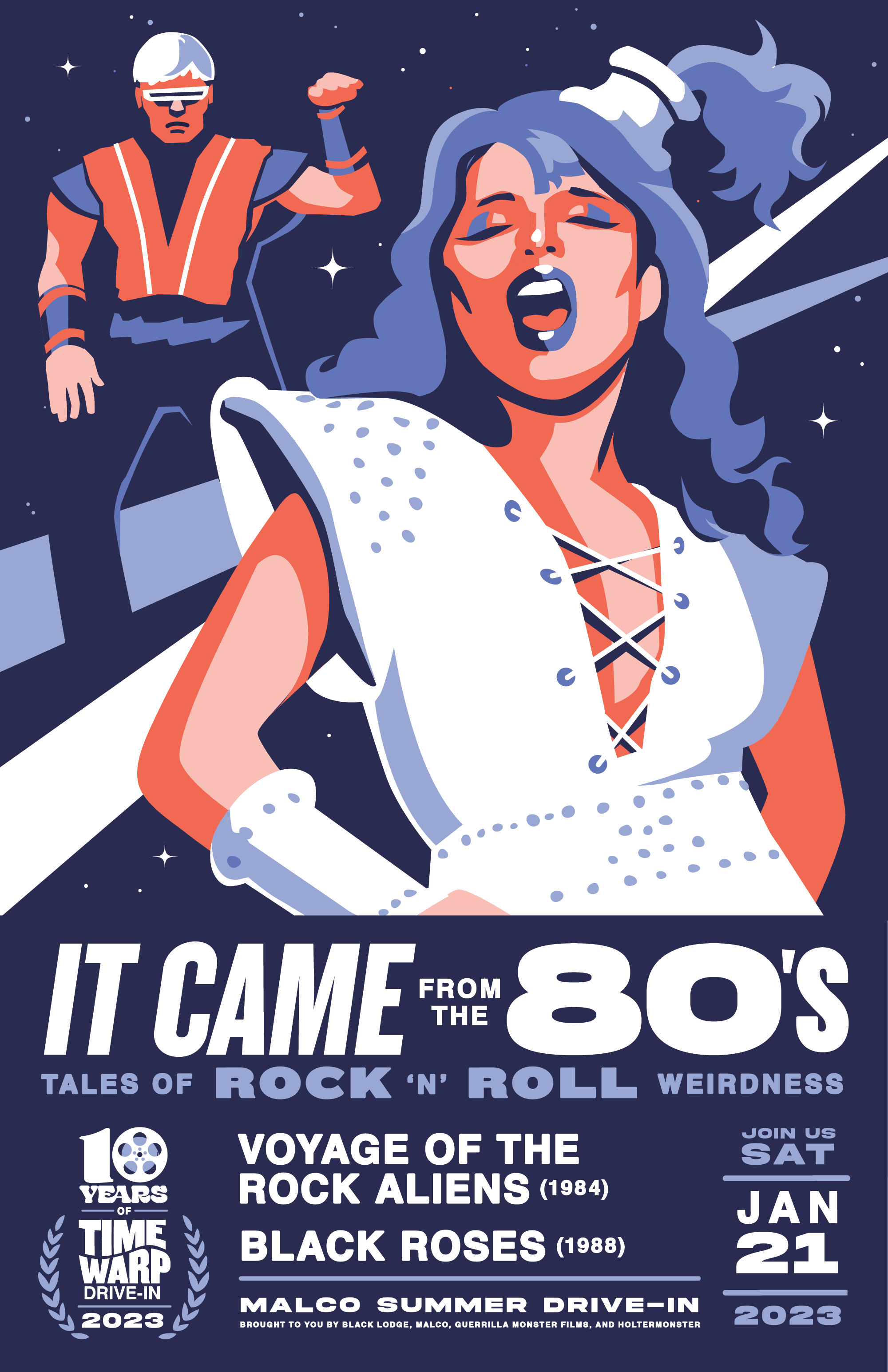

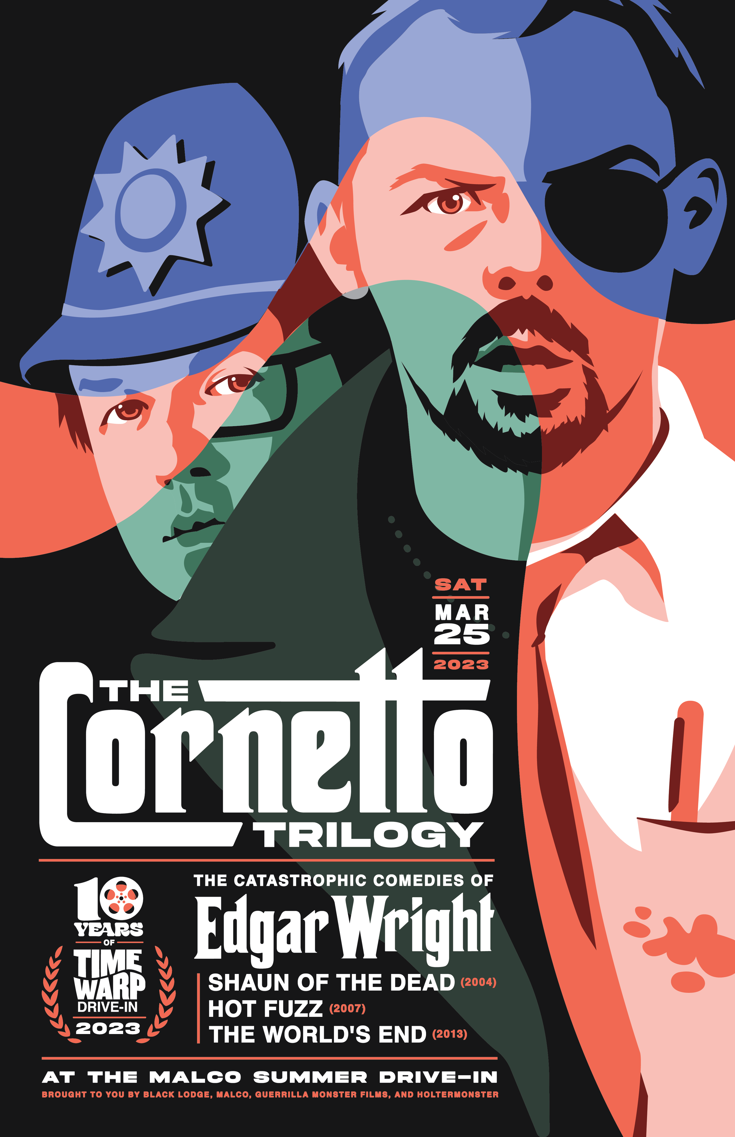
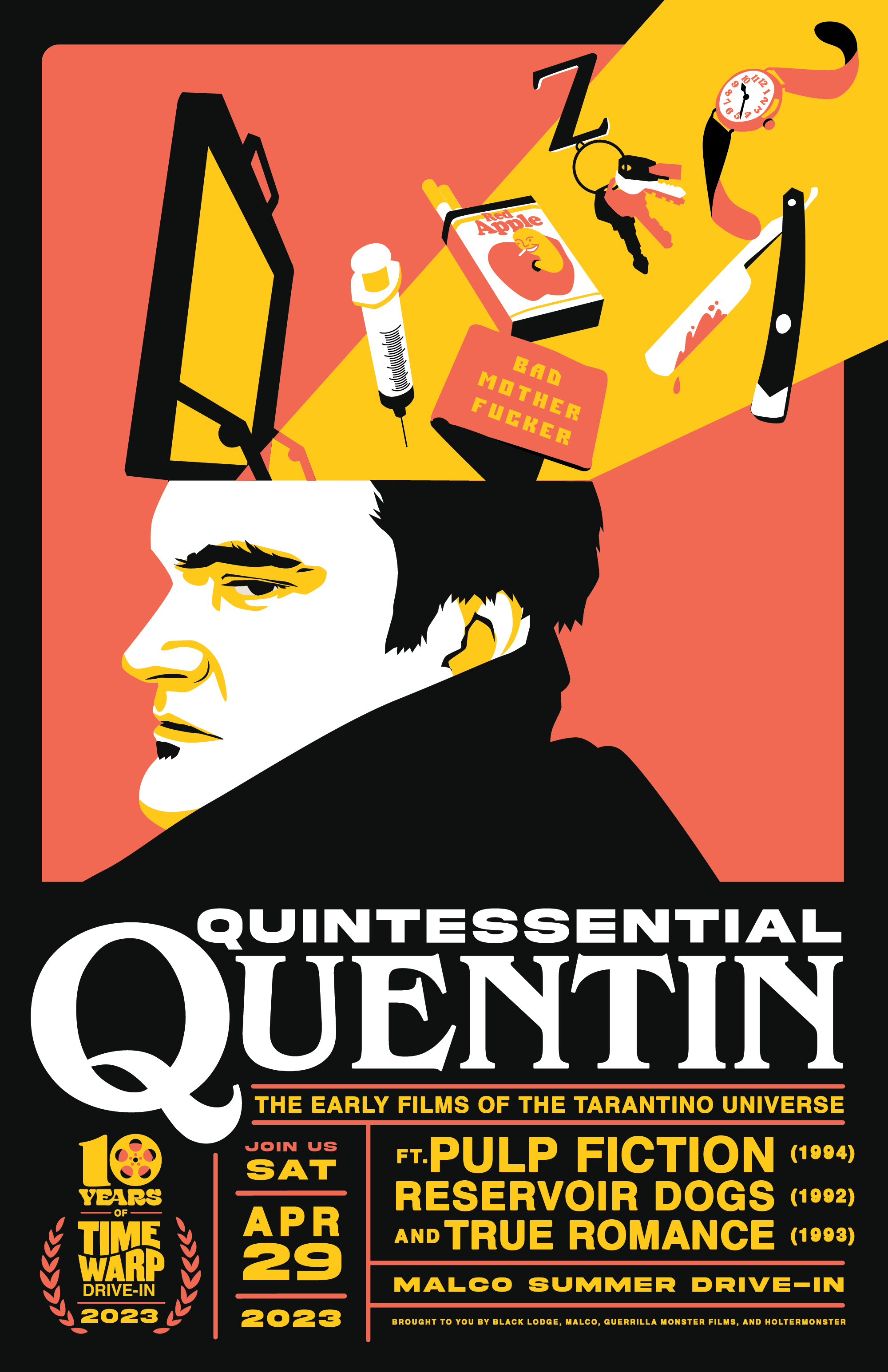
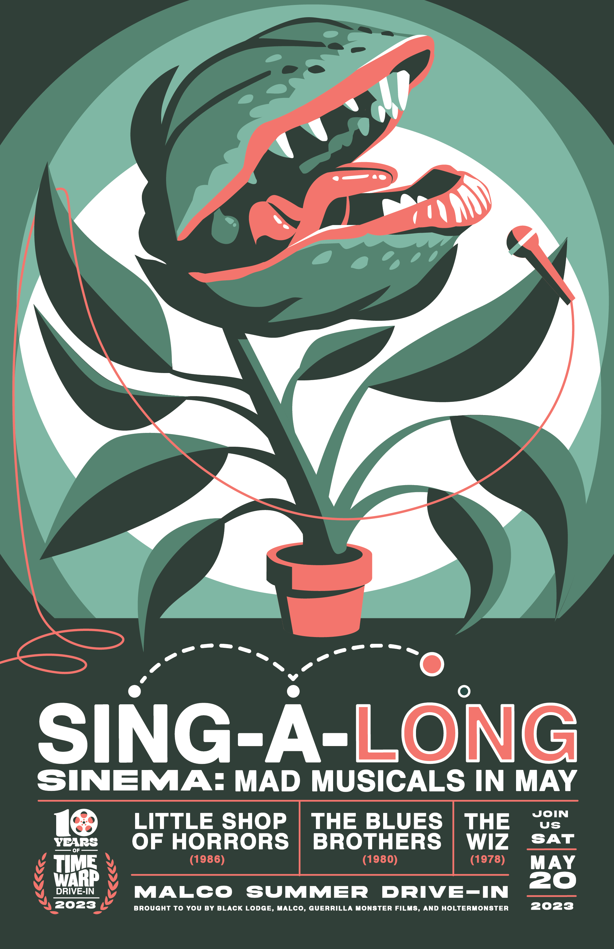


The poster art for this 10th season is bold and graphic. I played with lots of line work in Season 9 (scroll down to check it out!), but I chose to return to my signature flat, graphic vector style for this series. Another thing I’ve done a lot in past seasons is create a sort of template for the layout of the posters, but this season, chose to treat each poster as its own unique piece compositionally, and instead connect them all with a shared color palette and similar type treatments.
Time Warp Drive-In: Season 9 (2022)
★ A W A R D - W I N N I N G ★
The campaign for this season won a Gold Addy and Best of Print at the 2022 Memphis Addy’s!


To me, the art of Time Warp Drive-In Season 9 represents experimentation and risk. I created this wild season branding with pastel gradients, and thick black linework— two things I have frankly never used in Time Warp art in the 8 years before! The lineup for this season was very 90s, so I pulled very lightly from early web design (the stacked boxes reminiscent of pop-up windows) and 1990s sticker sheets (the illustrated icons for each night).


For the posters—I felt that when I’d concentrated on one character (and as such, usually one movie) in the past for Time Warp posters, it really narrowed the focus for me. I could worry less about marrying together themes from 3 or 4 totally separate films, and instead focus on creating one simple but strong illustration.
I chose an iconic character from the night’s lineup and added some sort of twist to their portraits— the shadows on Chucky’s face become a night sky for Night of Chucky; Indiana Jones is encircled by the coal car from the famous coal mine chase scene from Temple of Doom; Kevin Smith as Silent Bob’s head opens to reveal the Quick Stop from Clerks; Gene Wilder’s Willy Wonka looks on ominously through the pipework carrying away Augustus Gloop for our Beware of Adults night; Falkor flies right out of The Neverending Story and around Bastian’s head for the Bedtime Stories poster; and the sled loaded with Whoville’s stolen Christmas decor rests in the snowy fuzz of The Grinch’s Santa hat.
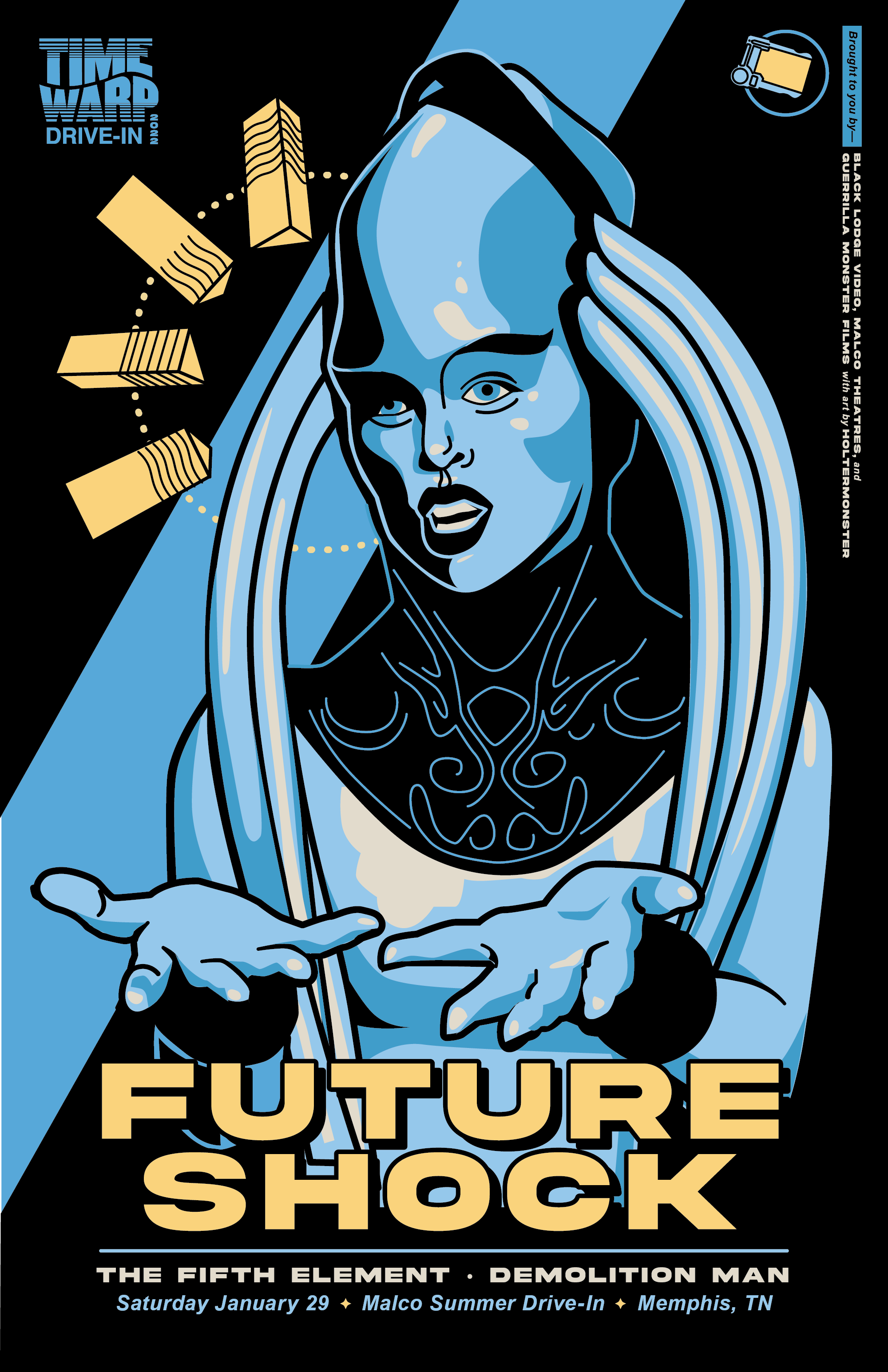
Time Warp Drive-In: Season 8 (2021)
The art of Season 8 is untouchable and you can’t convince me otherwise! For the branding, I pulled from VHS cover design, and created this lovely, simple season poster.


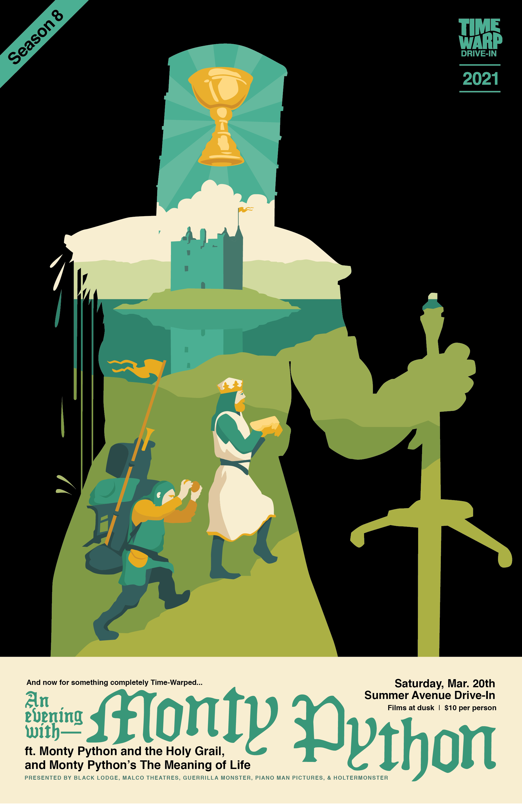


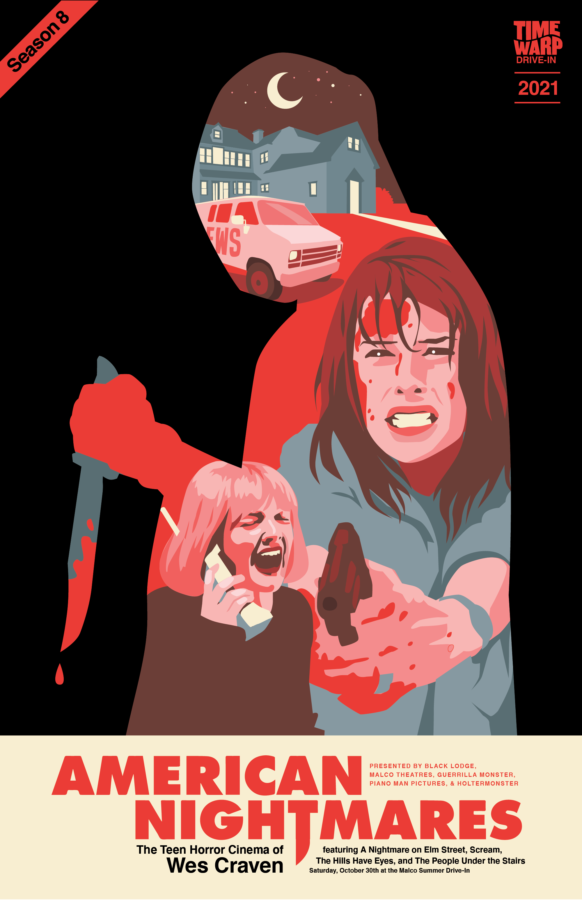


For the posters themselves, I chose the ‘headliner’ film for the night and created a recognizable silhouette from a major character, and then illustrated vignettes from the film within. I loved working with the playful mystery and simplicity of the character silhouettes in Season 5 (scroll down to see!), and I wanted to explore that idea more— but also combining the sortof illustrated moments of Season Six (scroll down less far to see!). What resulted is something I now have to figure out how to top every damn year.
Time Warp Drive-In: Season 7 (2020)
Tragically cut short by COVID-19


I put these soft hues against black halftone and voila— futuristic as fuck! This worked really great for the theme of the first couple nights too, but I think the look would have shifted over the season.
This was going to be our first totally year-round season, with 12 months lined up, but this season was cancelled in March due to COVID-19. Ironically, the final Time Warp Drive-In night before that was titled Doomed Future.
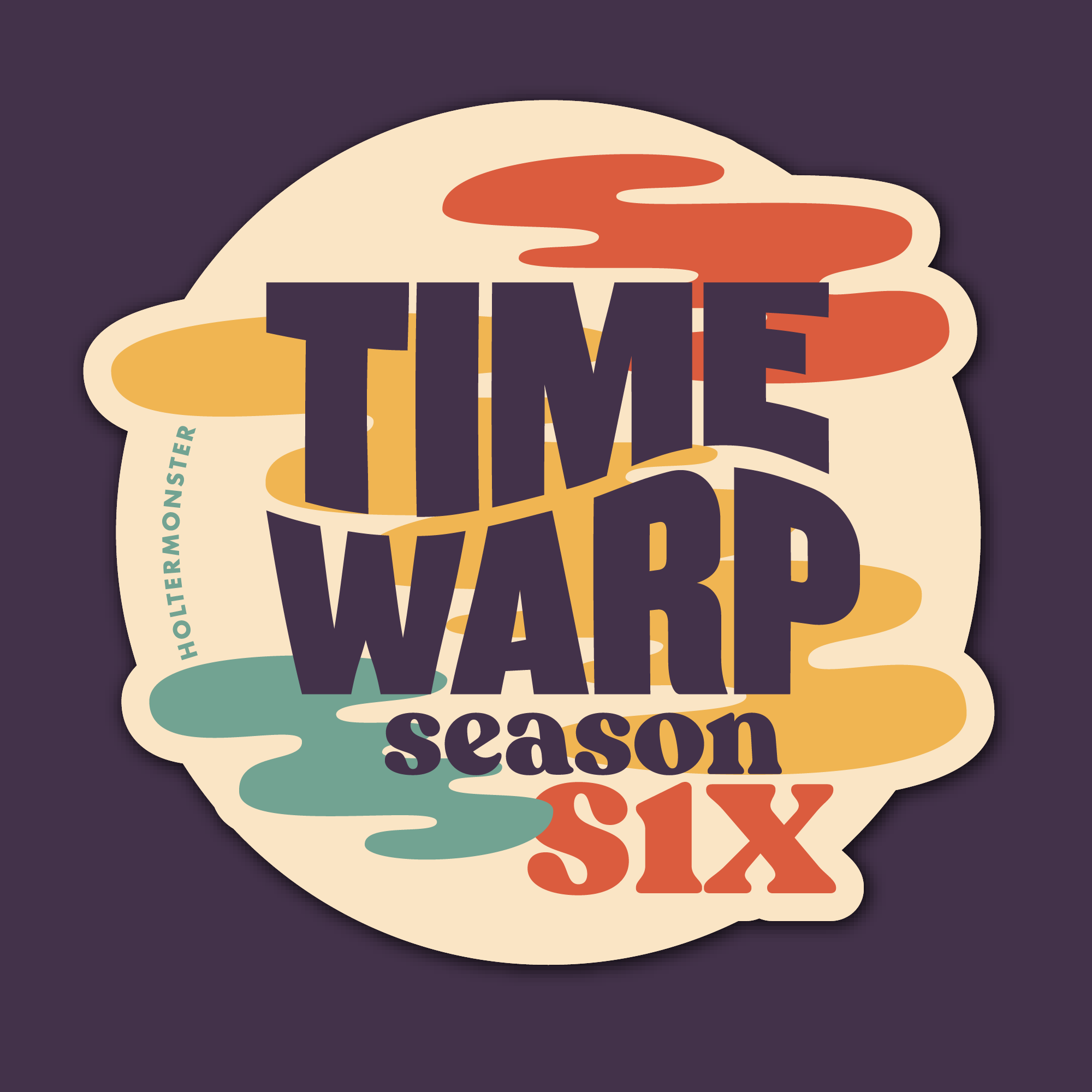
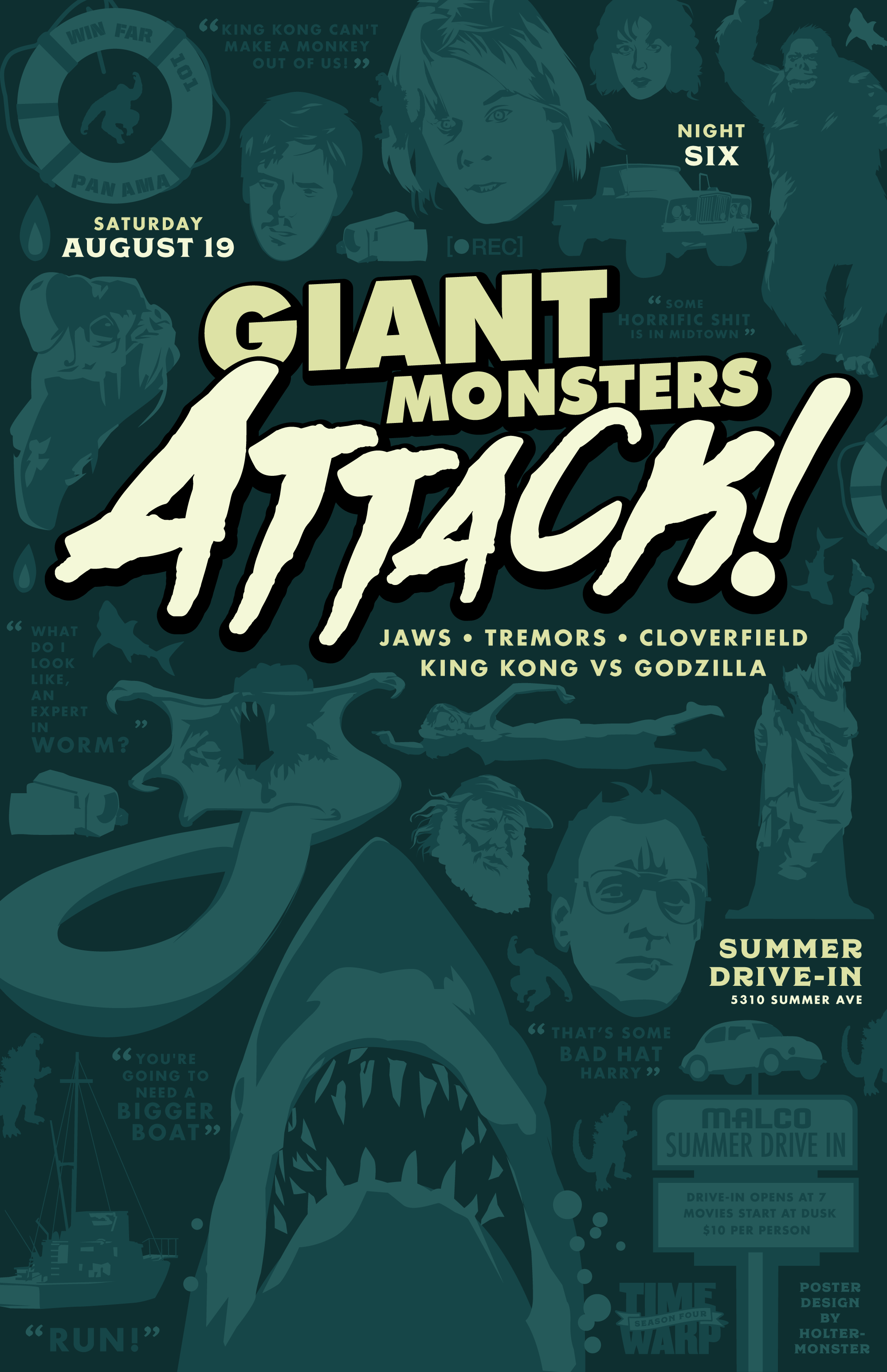
Time Warp Drive-In: Season Six (2019)

For Season Six at the Time Warp Drive-In, I wanted to move beyond the literal representations of the drive-in I’d used in the branding in the previous years, and instead focus on the magic dreaminess of movies, with these dancing film reels and smokey, blobby, liquid aura-like shapes all around.
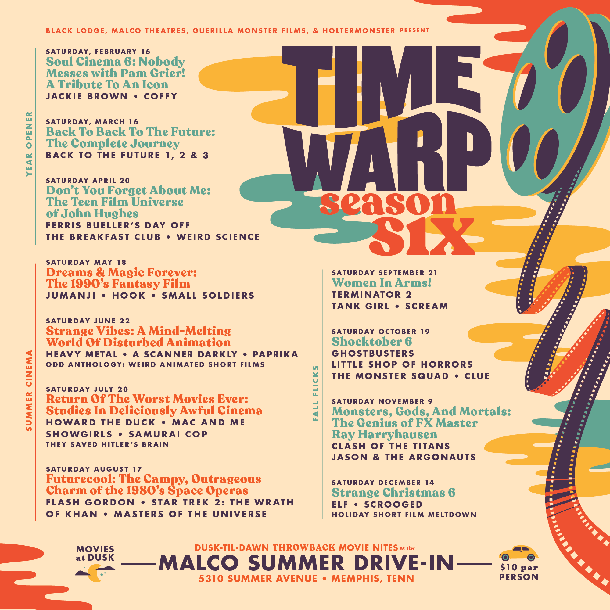


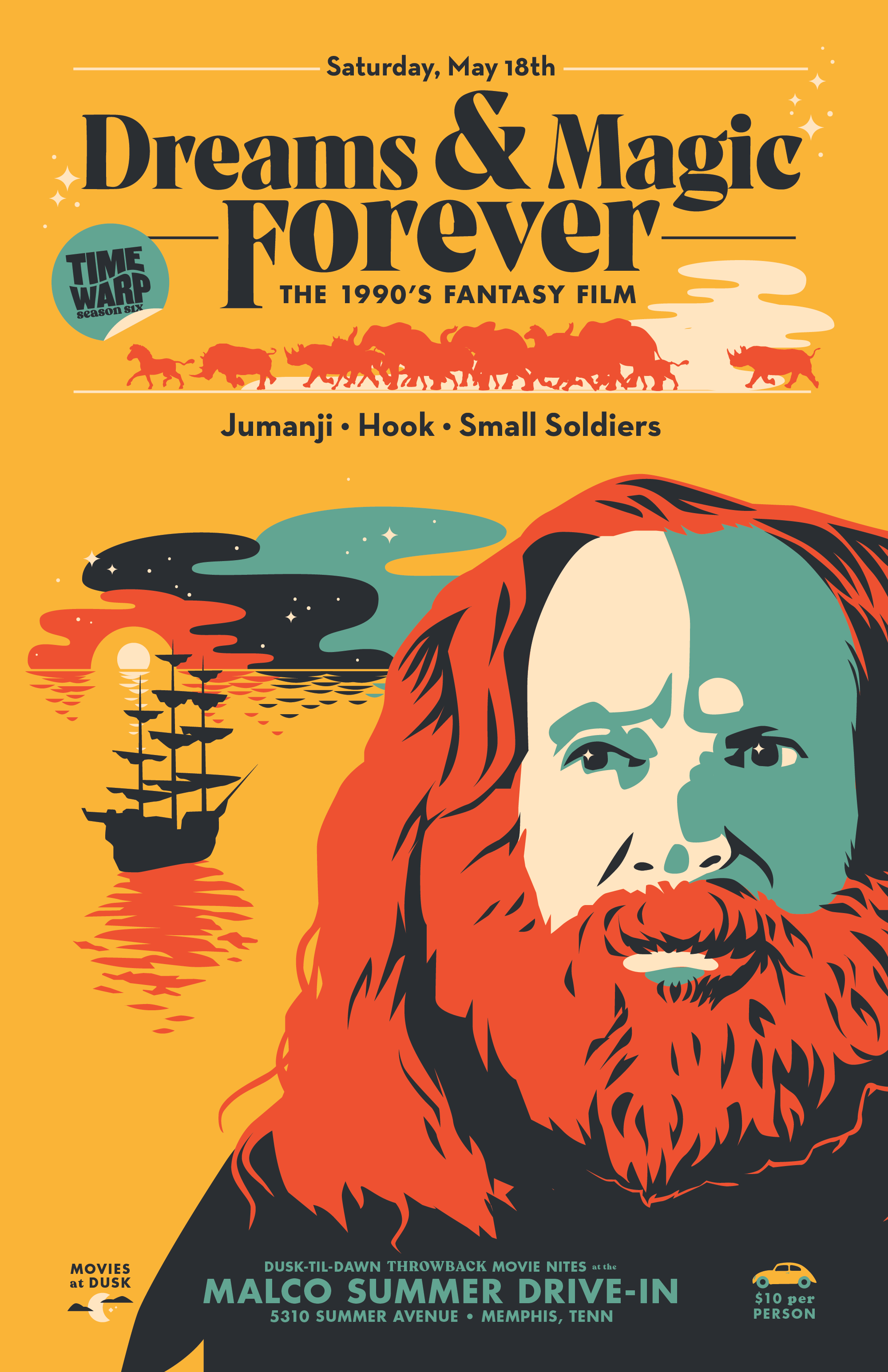


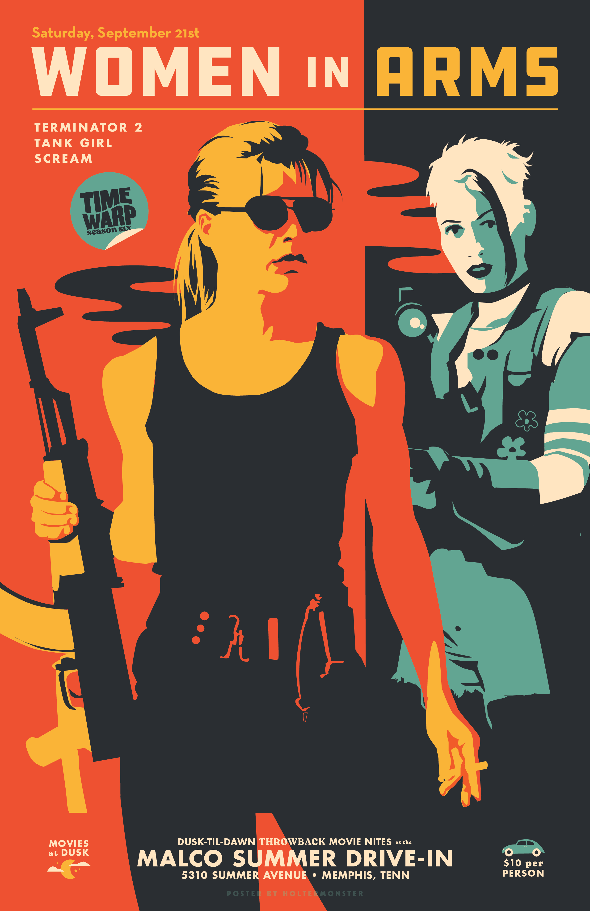
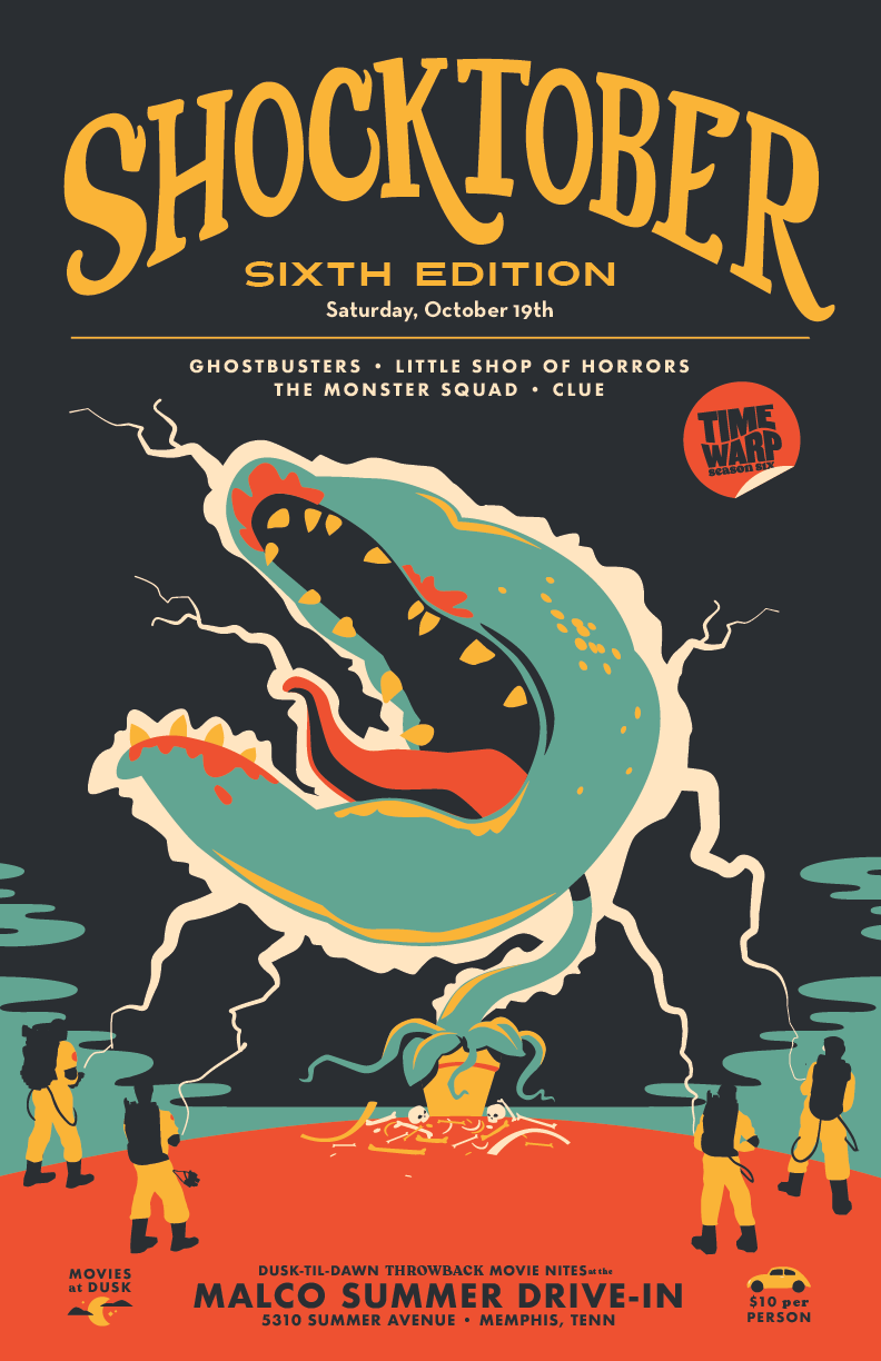


This season is heavily inspired by paperback book covers— and I truly tried to create an image for each night that felt like you’d see it on the cover of a well-worn paperback at a thrift store. Back to Back to the Future night uses a light-linework-of-a-machine-thing-on-a-dark-background style like you’d see on a sci-fi cover from the 60s; Don’t You Forget About Me feels like a Judy Blume-style coming of age tale (with a pun about weed and forgetfulness); Dreams & Magic Forever revives an approach I’ve used in earlier seasons— the combined movie poster, where Jumanji’s Robin Williams has waited in the jungle, perhaps near Captain Hook’s ship! Same with Shocktober (Sixth Edition), where we see the Ghostbusters take on Little Shop of Horrors’ Seymour with their proton packs.
Okay, last one— Women in Arms is definitely a badass beach read: about the teaming up of Terminator’s Sarah Connor and Lori Petty’s Tank Girl against the apocalypse!
Time Warp Drive-In: Season 5 (2018)


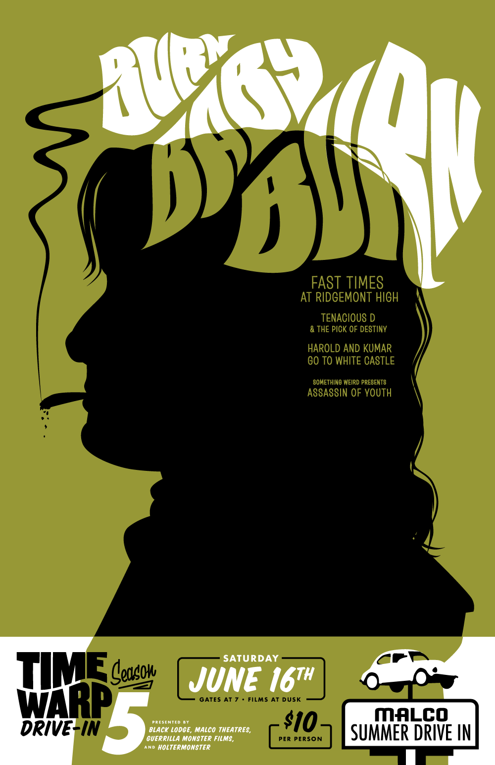


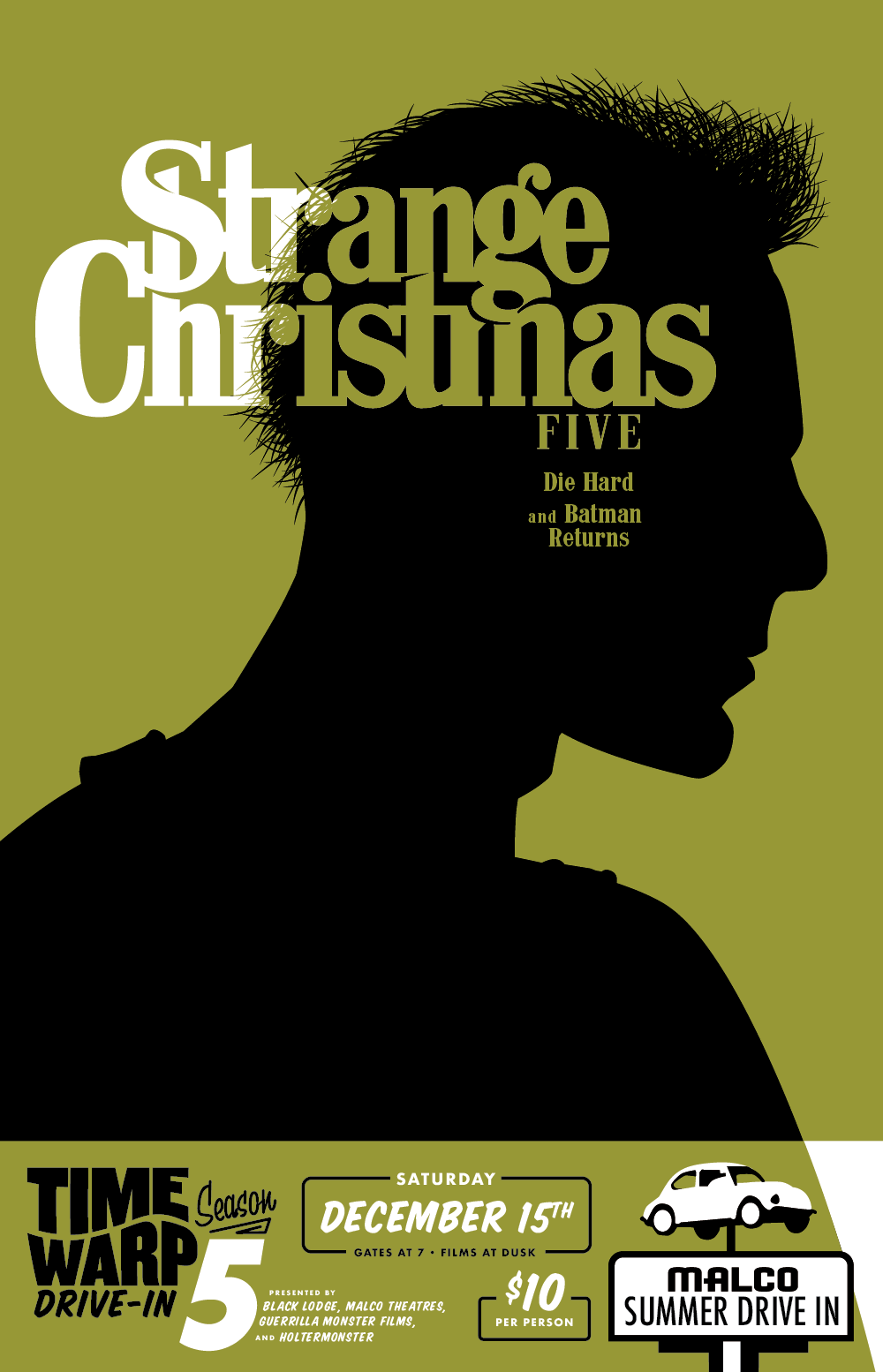

The poster series for Season 5 of Time Warp Drive-In is one of my all-time favorites! I love looking at these collections in order, seeing the natural ebb and flow of the creative process. In Season Four the year prior, I concentrated on creating these all-over patterns with low-contrast but very detailed imagery; Season 5 feels like a response to that approach, swinging the other way. You want to rely on the combination of dozens of characters, images, and objects to convey the theme of the night? Nope—let’s do it this time with just one character’s profile. You want to use a full range of colors and values?? No, we’re doing black, white, and an accent, pal. You wanna fuck around and place the event details in a different spot on each damned poster??? Think again, dummy— we’re creating a template we can play off for each night so that basics don’t get lost.
Another cool thing about Time Warp Drive-In Season 5— it’s the first year where I thought to visually marry the season branding and the poster art! I used a similar graphic style for both, as well as big fields of black, and a shared color scheme— and then also repeated a lot of the branding elements in the posters.


During Season 5, I was inspired to make these packaged novelties for a few of the nights! I snipped down some regular-sized adhesive mustaches to create the Pencil Stache for our John Waters night Trashy Sinematic September. For Strange Christmas we screened Die Hard, so John MacClane’s Butts and Bullets were available (fake cigarette butts and fake bullets!). For Shocktober that year, we spotlighted vampire flicks, so the novelty pack was a pair of plastic fangs and a single fake blood pellet.
Time Warp Drive-In: Season Four (2017)

Die-cut sticker for Season Four at the Time Warp Drive-In. This season’s branding was inspired by Memphis summer sunsets at the drive-in.


The fun thing about a self-directed project is that you get to do whatever you want. For Season Four in 2017, I wanted to experiment more with really wild illustrated typography and I wanted to create compositions out of patterns. Also— these posters were starting to sell, and I wanted them to be pieces that movie nerds would actually want to own— so I also decided let’s really pack in a fuck-ton of movie references.
This series created some really badass standalone type treatments, which is where I put a lot of my creative effort, letting the images from the movies be a lot less stylized. This is also the first year I thought to create a look/poster for the entire season, which with this sticker, made it the first Time Warp season branding campaign!
Time Warp Drive-In: Season 3 (2016)


Time Warp Drive-In sticker for Season 3, inspired by John Carpenter’s classic They Live.

2016 marked 50 Years for the Malco Summer Drive-In!
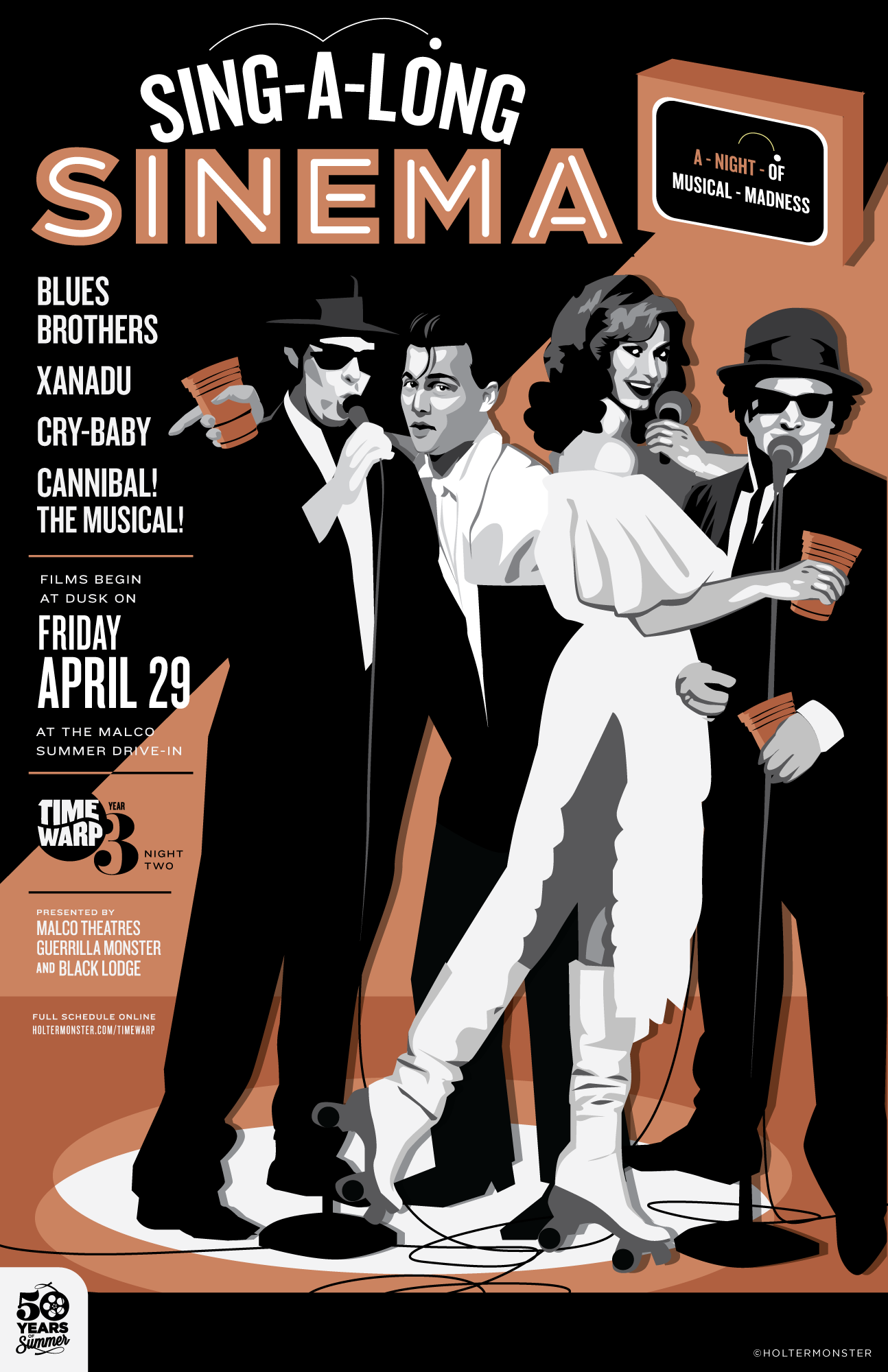
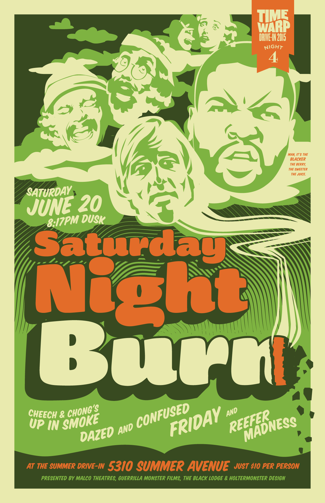
For the posters of Time Warp Drive-In Season 3, I continued my newfound approach from Season 2 of creating movie-style posters for fictitious films that combined all the movies on the lineup for that night. This created a lot of really fun images— Xanadu’s Olivia Newton-John joins Crybaby Johnny Depp and the Blues Brothers for a karaoke number for Sing-A-Long Sinema night; Lori Petty’s Tank Girl and Brandon Lee as The Crow are neighbors of Blade in Sin City for Comic Book Hardcore night; Johnny Depp’s Hunter S. Thompson from Fear and Loathing join Tommy Chong and Dave Chappelle for Return of the Burn (as Dude on the Couch floats above), and we can fantasize about The Thing’s MacReady teaming up with They Live’s Roddy Piper for the ultimate humans vs. aliens battle.
Time Warp Drive-In: Season 2 (2015)
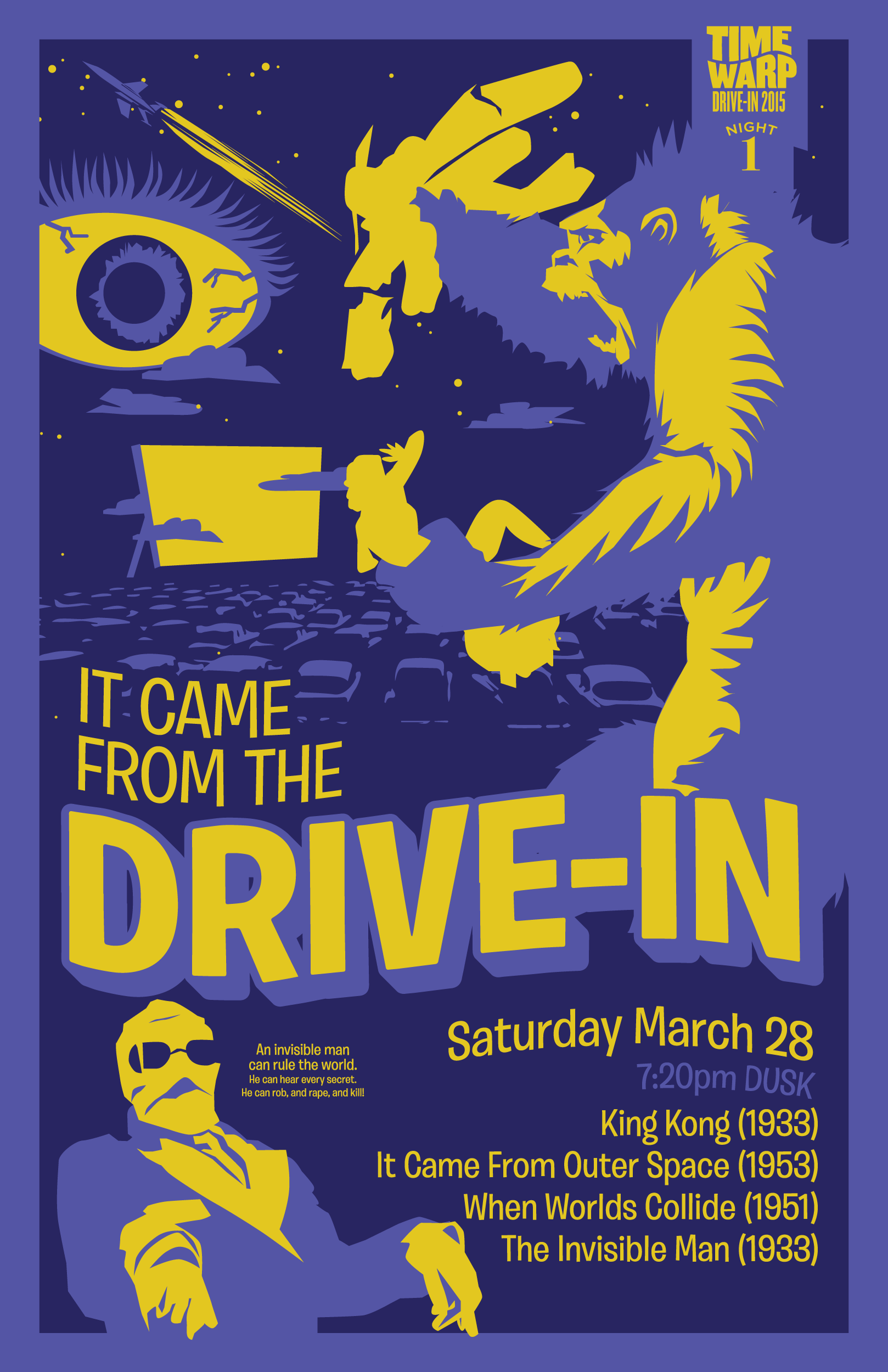


This series for our second season in 2015 shows a big leap in the evolution of Time Warp Drive-In posters. For this season, I created a plan to treat this collection of posters as a series, like an illustration series or a design campaign. Each one uses a similar graphic style, featuring vector imagery, and illustrated typography. But beyond unifying the visuals, I chose to unify how I composed them as well— approaching each one as its own movie poster for a fictitious film that’s a combination of all the films playing that evening.
With this approach, you get some really fun moments: King Kong takes down a plane as Worlds Collide overhead for It Came From the Drive-In, Mel Gibson’s Mad Max leads a crew of ruffians from The Warriors through the hellscape of Escape from New York, the Spaghetti Western Buffet poses Clint Eastwood with Lee Van Cleef and Elvis Presley for a star-studded shoot-out, and Cartoon-A-Palooza creates an animated freakshow where Roger Rabbit’s Jessica Rabbit stars alongside Fritz the Cat and Bugs a la Space Jam.
Time Warp Drive-In: Season 1 (2014)


The spring after our inaugural event, we kicked off our first Time Warp Drive-In season, which were these six themed nights sprinkled between April and October. This collection of posters together has always felt a little disjointed to me as a series— but now looking back, I see it more as a story.
You can see in the first three (Soulful Cinema, Memphis Cult, and Hell on Wheels), I was looking to capture the theme of the night with a central illustration, rather than super specific film references. The fourth one in the season, A Real Horror Show—a night devoted solely to Kubrick films—I started to toy with more specific film references: the iconic image of the cowboy riding the nuke in Dr. Strangelove, the infamous carpet pattern from The Shining, a fetus floating in space a la 2001, and A Clockwork Orange’s creepy milk. In the fifth poster—another director spotlight, this time on Tim Burton— I inched closer to more specific representation from the films with this mashup of lead characters from each of the films playing that night. By the end of the season at Shocktober, I finally delved into illustrating actual moments from the films, translated into my style— though very separately.
Over this series, I can see initially I fought using imagery based on the actual films, approaching them more as illustration prompts. It didn’t take me long to realize I was sitting on an absolute goldmine of imagery and characters to pull from, and that being a little more specific to the films on each bill would not only create better movie night posters, but really speak to the fans of these movies— the exact folks we’re hoping would come to an event like Time Warp Drive-In.
Time Warp Drive-In: Season 0 (2013)

Time Warp Drive-In began as just a single proof of concept event in October 2013, and it was also our first ever Shocktober!— the start of our annual horror night in October. People actually showed up for throwback movie programming at the drive-in, so the next spring was our first full season.
I did a lot of free posters for Black Lodge in the 2010s, so this was just another one at that time, but it of course ended up being so much more than that: A legendary local event, a celebration of cinema, a revitalizing catalyst for a historic drive-in theatre, and a very fun ongoing poster series.
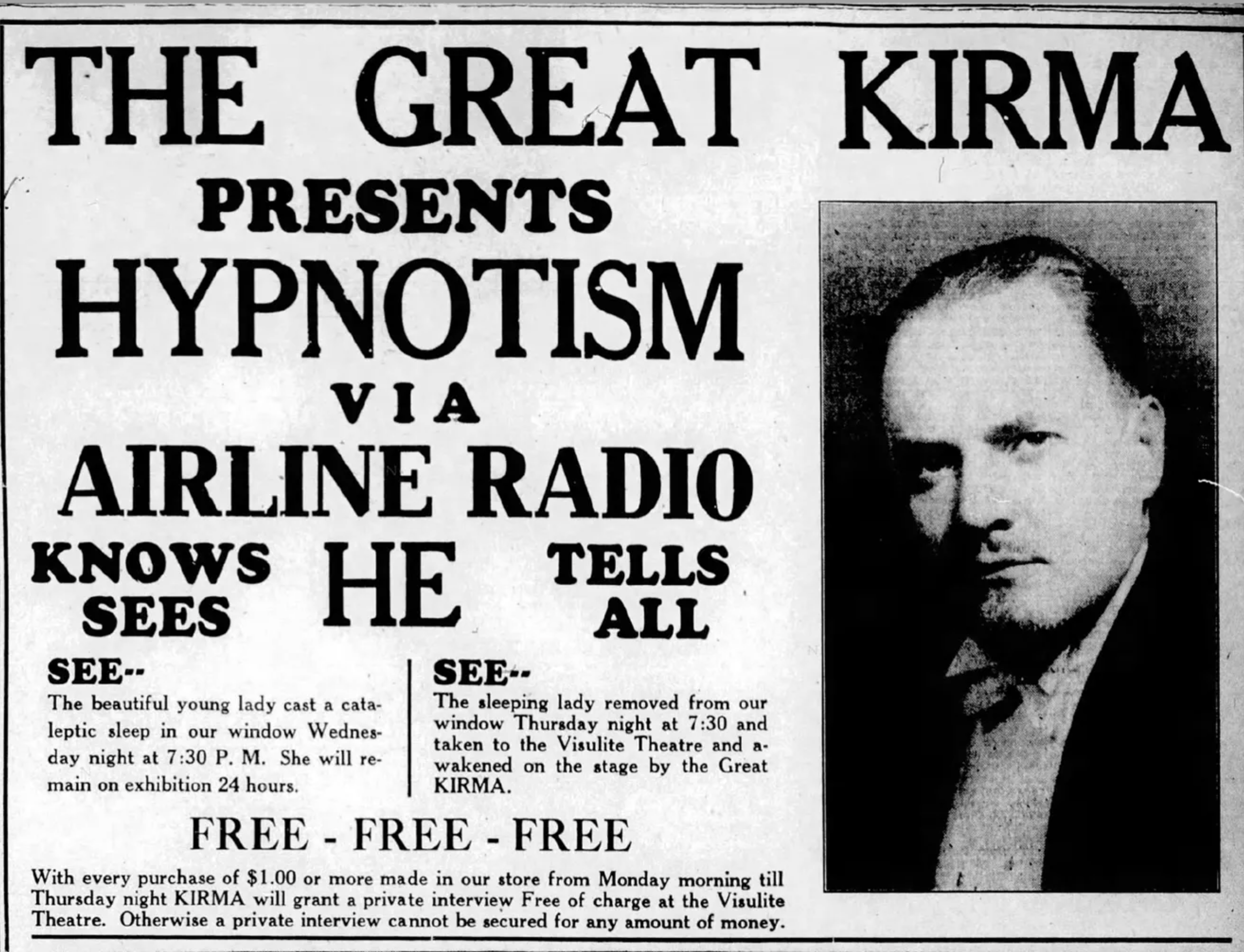
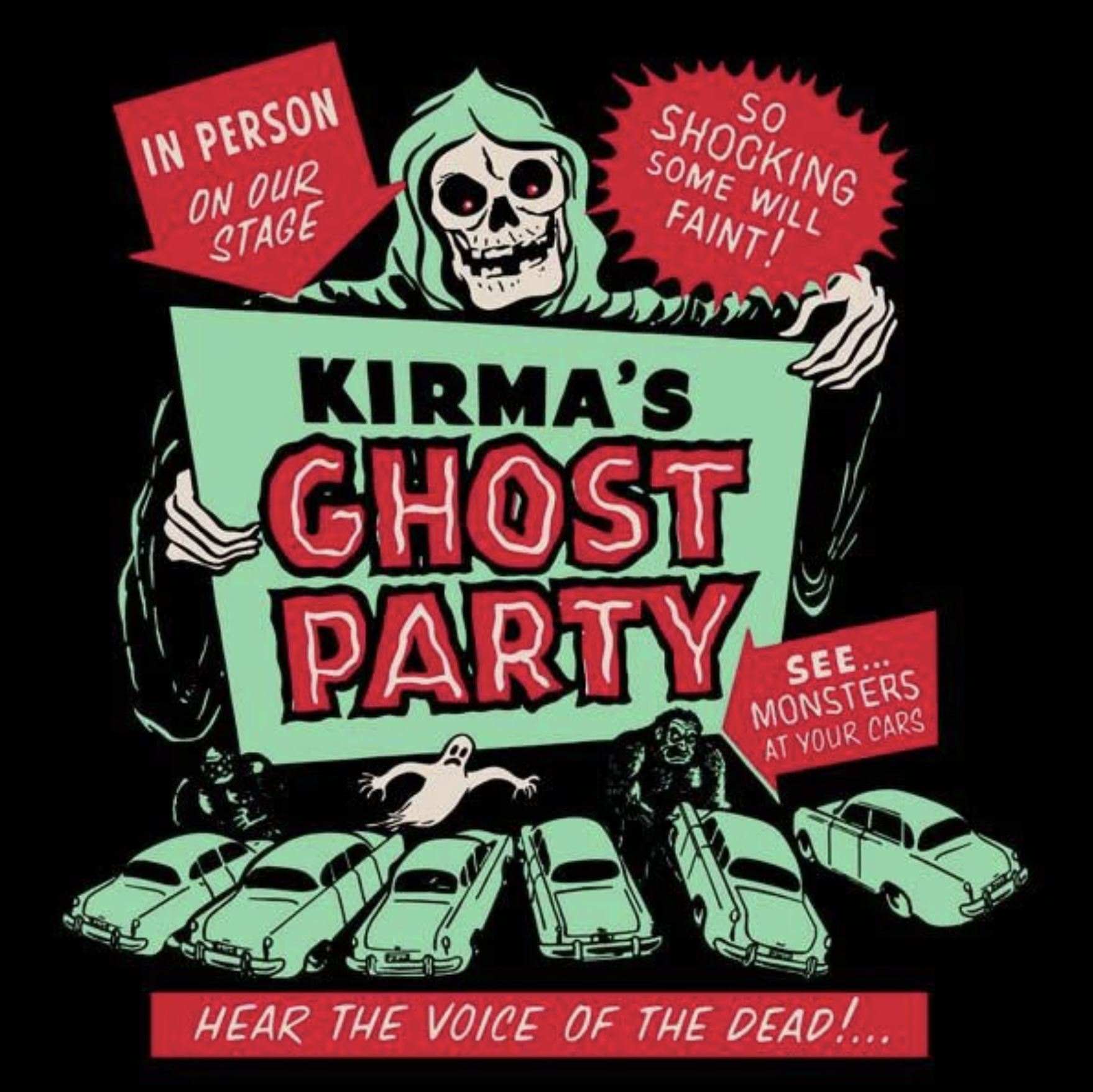
This first Time Warp Drive-In poster was based on this cool old poster for Kirma’s Ghost Party, a traveling midnight ghost show in the 1930s! Kirma was a mentalist who claimed he had ESP and could commune with the dead.
“Midnight ghost shows (also known as spook shows, midnight spook shows, voodoo shows, or monster shows) were traveling stage shows that originated in the United States during the Great Depression.[1] The shows were influenced by the stage magic traditions that preceded them, and typically incorporated illusions; simulated séances; interactivity between a host—often called a “ghostmaster”[2][3]—or performers and the audience; a “blackout” sequence in which the theater would go completely dark; and horror film screenings before or after the show.”